Navigation
Install the app
How to install the app on iOS
Follow along with the video below to see how to install our site as a web app on your home screen.

Note: This feature currently requires accessing the site using the built-in Safari browser.
More options
You are using an out of date browser. It may not display this or other websites correctly.
You should upgrade or use an alternative browser.
You should upgrade or use an alternative browser.
Art thread
- Thread starter Sameiru
- Start date
Sixty
Kryptonightingale
- Jan 27, 2009
- 266
- 0
- Wii Online Code
- 0000-0000-0000-0000
Drama in the art thread is interesting.
I just have a problem with the way you dismiss everything as cartoon when there are certainly different ways of approaching it. Cartoon for me is strictly something that is a doodle that doesn't resemble realism at all, with bold colors. I'd in fact love to be a cartoonist, but the field is way too competitive for my liking, and I'll go nowhere with it. You have to be outstanding if you want to pursue anything to do with realism too.
I was always criticized because my portfolio was full of manga drawings. Those people didn't dislike my drawings or anything, it's just that they've seen it all before. Very often people will look at manga and think that they can do it too, because they like an anime or something. It's so badly pulled off that it just annoys people sometimes. Not many people are drawn to realism when they're just sketching. To be honest, people can't be assed finding a reference to draw for realism, so people looking at your work consider it to be lazy. Though, it was just due to the fact that all my other stuff was in another place being graded and I just had my leisurely portfolio hangin' around.
I did know the artist of that blue square. It isn't just a blue square. He/she's done a load of them in various galleries of just block colour. I don't remember what they represented at all though.
Bio, you need to keep posting your stuff. I think your work is amazing and you certainly have a terrific talent.
But on I go, off to art class in this miserable and freezing morning.
Frogger
God Complex

=)
Frogger
God Complex
Thank you. : D
I personally don't like it as much as all th other busy as hell pieces I've done.
I personally don't like it as much as all th other busy as hell pieces I've done.
Bio
WiiChat Member
- Jan 25, 2009
- 1,078
- 0
Well, I feel that this has the best composition compared to your other offerings. Everything comes together so well. It has variety, great word placement, detail, superb craftsmanship, scale, focal point, everything. It could even make a really awesome stamp of some kind. It's really, really good.
I've always loved when people make pieces where everything is crammed together, even if none of them have anything in common with each other. I just like how they build off of each other.
Good job, I live it.
:thumbsup:
Good job, I live it.
:thumbsup:
Gikoku Harakami
ミュージック
Well, I feel that this has the best composition compared to your other offerings. Everything comes together so well. It has variety, great word placement, detail, superb craftsmanship, scale, focal point, everything. It could even make a really awesome stamp of some kind. It's really, really good.
Agreed, I like this one a lot better than your Marilyn Monroe piece.
Well done, Emma.
JagsRock95
WiiChat Member
- Jan 28, 2009
- 114
- 0


i got a bunch more but havent scanned em yet
JagsRock95
WiiChat Member
- Jan 28, 2009
- 114
- 0
thanks! ya these were drawings that I never really got back to. also these were scanned with my old printer which was crap that's why the lines are light grey.ill upload sum more finished stuff soon
Sixty
Kryptonightingale
- Jan 27, 2009
- 266
- 0
- Wii Online Code
- 0000-0000-0000-0000
Try inking and coloring it. Also, how old are you? =)
But hai.

Uhm, yeah. Unfortunately, I was a tiny bit unprepared for class and I didn't bring an eraser, let alone a putty one. So I couldn't erase anything or add highlights. There are tiny things that bother me, like the bottom ellipse on the pot I actually bothered to finish, and the left handle on it. I sit too far away from anyone else to borrow things. I think it looks quite decent though, I would have liked to take a photo of it but my camera has went into lockdown, so I need that repaired.
It's really annoying me so much. I wish I would have brought one. ;_;
JagsRock95
WiiChat Member
- Jan 28, 2009
- 114
- 0
im 17
Bio
WiiChat Member
- Jan 25, 2009
- 1,078
- 0
You shouldn't be embarrassed :/
Your last piece was marvelous.
Thanks, man. It's good to know others still like it. It's just to my expectations out of myself as I look back on it, that I think I should have done much better since I was showcasing it.
JagsRock: Nice sketches. My favorite is the arrangement of your middle picture. Keep up the good work. =)
Sixty: Looks fantastic for not having an eraser. The best part is the reflection of the smaller pot and the inside shading of the "real image" of the small pot. Very convincing. I like how your pots are arranged on the paper, too. The perspective is a little off on the small pot's bottom curve in comparison to the top curves, so if you get your hands on an eraser, that might help this part out a bit.
Anyway, it's looking real good.
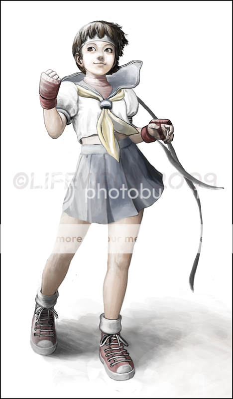
Okay, revised Sakura a bit so far. This image is still annoying me to death, but is a considerable improvement over the last (embarassing) version I posted. Still have to refine shoes, sash, and skirt, but this is how it fares so far. Still somewhat confused, so I need comments again before I finish this thing (there will be an entire scene to go with this).
--A Work in Progress.
Last edited:
Sixty
Kryptonightingale
- Jan 27, 2009
- 266
- 0
- Wii Online Code
- 0000-0000-0000-0000
Yeah, the bottom part's the bit I've been going on about that's been annoying me. I'll get to fix it on Monday. I don't think I'll finish it in two hours though. The top of the unfinished pot looks like it's going to be going the wrong way with the curve, or too dark, so I'm going to chop that off. I only had B and 2B, the rest were all lighter than 2H. I should start bringing my stuff.
That looks excellent, you cleaned up the line art very well and all the shading has came out smooth. I love the lighting on the clothes, especially her skirt. The laces just look a tiny bit dark in comparison to everything else. Do you just erase around the outline of your line art or totally erase it and draw up small lines? It's very impressive.
That looks excellent, you cleaned up the line art very well and all the shading has came out smooth. I love the lighting on the clothes, especially her skirt. The laces just look a tiny bit dark in comparison to everything else. Do you just erase around the outline of your line art or totally erase it and draw up small lines? It's very impressive.
Bio
WiiChat Member
- Jan 25, 2009
- 1,078
- 0
Ah, yeah. Very light Graphite arsenal you had there. You did well with what you had, though. Although this would benefit with darker dark sections, There's enough contrast to make a sufficient statement to every shade and reflection. I think your left handle looks good to me. It's mainly that bottom perspective of the small pot right now.
And...Ouuch. Yeah, I still have to tend to those dang laces.
As for fixing Outlines, I changed my approach while fixing them. I decided I wanted more realistic contours instead, so although I sharpened the lineart, I also gave colors to them. It may not look like it, but the only black outlines left are on her shoes (I haven't fixed them yet). But anyway, I'll explain how I've been fixing my lines:
Inner outlines (ex: the distinct contour line on her left breast): I colored over an old black line with a "masking color", which is simply using a neighboring color to make the line appear to be gone. Then I applied a lighter, thinner, more polished line by going back and forth between a "masking color" and the "new line color" to polish it up. The color I chose for the new line was to be similar and slightly darker to the form's color instead of just being pure black (to create more realism).
Outside outlines (ex: the outline of the blue collar section behind her head): Since one side of an outer line is empty space, two methods were involved. The first is the same as before: a mix of removing the old line with a masking color and applying a new line color until it's refined. The second is to deal with cleaning the edge of the line that is next to the empty space...which is handled by mixing between erasing and re-applying the part of the new line color to clean up its edge.
Once I changed any outline, though, I went back in and put more shading or lighting by the contour (re-refining the line if necessary, of course). Black outlines make contours the most obvious because it will always contrast from everything else, making the clarity of forms less dependent on the shading quality (ex: my avatar has very light, minimal shading). When there isn't such a black, contrasted line to illustrate the contour anymore, the color or lighting/shading of the form(s) around it has to make the appearance of an edge more apparent than it originally needed to when the outline was black.
Last edited:
Similar threads
- Replies
- 6
- Views
- 1K