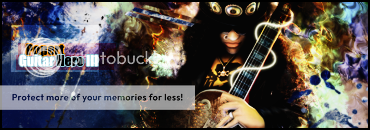
Official Graphics Comments & Criticism

iRAWR said:
it was meant to be dark...since..well, its assasin's creed

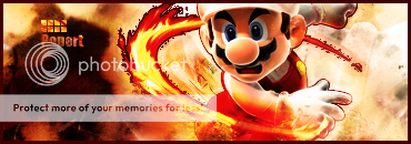
is that pen-tooling around the guy/girl
nicely done

wasn't able to pen tool very good in gimp :(


Well actually, Assassin's Creed is a very, very bright game. There's really no darkness at all. But as I said, your lighting effect balances the darkness perfectly.

And I've been practicing a lot with my pen tooling cause if you get it down good, it can look really nice and make for a great effect, especially since I'm so limited with GIMP
 
Sneaux125 said:
Well actually, Assassin's Creed is a very, very bright game. There's really no darkness at all. But as I said, your lighting effect balances the darkness perfectly.

And I've been practicing a lot with my pen tooling cause if you get it down good, it can look really nice and make for a great effect, especially since I'm so limited with GIMP


i know the game takes place in.day time...mostly

bu the way he dresses...seems very gothic/emo-ish...if it wasnt white/gray
 
i made my first gimp sig for pikachu256


i1434601_pikachusigforpikachu256.JPG
 
bw, it looks too dark and bad quality, try keeping the colors right, and work on effects and background...
_______________________________________________
SlashSig.png

Disastercopy.png

My latest, ehh, not too good... But can someone actually give me some tips on these?
 
Last edited:
The iPhone box looks distorted and out of place. Also, the flow of movement behind the foot of the player doesn't look right.
 
Syntax said:
The iPhone box looks distorted and out of place. Also, the flow of movement behind the foot of the player doesn't look right.
In photoshop it looked right but when I saved it as a Png. it messed up, and it looked even worse when I posted it here...
 
I am error
Wrong thread
A owl stole the moniter thus makeing me look at the wrong place
PLEASE DELETE
 
Last edited:
Popert said:
bw, it looks too dark and bad quality, try keeping the colors right, and work on effects and background...
_______________________________________________
SlashSig.png

Disastercopy.png

My latest, ehh, not too good... But can someone actually give me some tips on these?

i made it darker because it has lightning effects
 
Thanks, it was hard because I accidentally added a stroke to the render early in the sig and didnt notice until I started to smudge :sick:
 
Back
Top