Official Graphics Comments & Criticism

Finally back! School is tiresome.
Gikoku said:
Man, that is awesome, Byu. :)

I really love the smudging you did in the background, and the text is well done also (including it's placement). The only part that kinda bugs me is that piece in the lower left-corner. Though it fills up the empty space there, it seems kind of distracting because of it's quality (like there's too much Sharpen on it.). Other than that, the color choice really brings alot of attention to my eyes (and the girl ain't half bad either). :D

--------

And another request I filled in the other thread, thoughts?:

Beat.png
Not really feeling this one too much. I mean, I like what you did...I just don't think it's enough. I think you're were going for simplicity with the background, but you could add a few more foreground effects.
Gikoku said:
Alright.

Here's one I just whipped up for a friend of mine:

YagamiLight.png


Hmm, I'm just not sure if I got the border right...
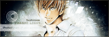
I like the border, it's actually pretty good. The light behind him is too bright (especially considering the light source is coming from the left :p), but I like the way it looks. Nice job.
 
dragon2.png


dragon.png


OMFG ULTRA N00B ALERTZORS

C&C...*guards face*
 
Fractal+Render+Image>Apply>Image>+Duplicate+Drag both layers under the top one? Blue one's better.
 
Looks good to me. However, the render seems a little blurry. Although, that may just be me.
 
Latest;

Street Fighter Sprite Sig (My First)
RyuSpriteFin4.jpg


Avatarique
cap.png


More Avatarique
callmecappin.png


Is that a matching sig?!
signature.png
 
Cpt.McCloud said:
signature.png
[/CENTER]


I like the caption. Although it looks like you used only one brush set. Try to variate :)

Nice and colourful though


Cpt.McCloud said:


Looks abit plain. Although I like the direction made through the smudge


Star Striker said:

I do like this however it's abit plain in the middle don't ya think. Try to do something about that


My Latest: Comments?

TravisPNG.png
 
Last edited:
Cpt.McCloud: That is a very nice Sprite Sig. Although it is a little plain, I really like the smudging technique used and the overall flow. Nicely done.

Surfinrach90: That is a very colourful piece Rach. My only suggestion would be to try and add some more effects other than swirls. Nicely done.
 
Last edited:
Currently working on a sig, is a collab between .vagrant and myself (fellow member of the Demented Ninjas on PR).

He sent it to me like this:
grayWIPv2.png


I've done this to it:
Ver. 1:
graywip2bb4.png


Ver. 2:
graywip3jy1.png


First Grayscale sig I've been a part of :p Still a WIP.
 
Looks nice Mike. I like the look of version two. Should be interesting to see the final product.
 
Back
Top