Official Graphics Comments & Criticism

this thread looks really cool! Im a photo shop newbie, so i think this thread wil be fun..
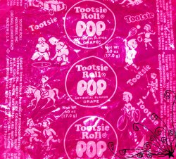
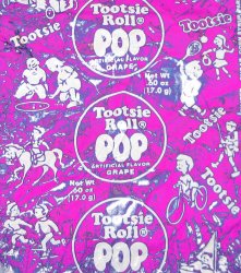
I took picture of a tootsie pop wrapper and then I edited the color...

pink tootsie pop.jpg
tootsie pop pinkish.jpg
 
*Gymnast* said:
this thread looks really cool! Im a photo shop newbie, so i think this thread wil be fun..
I took picture of a tootsie pop wrapper and then I edited the color...

View attachment 3944
View attachment 3945

Next time you post an image of any sort use
. This code is will let us see the whole image.

And you already made one mistake that I can't forgive.. you said that this thread is cool, NOOO HOMIE!!! WE ARE THE ONES THAT ARE COOL!!! WE!!!

:cool:
 
demonflair said:
Next time you post an image of any sort use
. This code is will let us see the whole image.

And you already made one mistake that I can't forgive.. you said that this thread is cool, NOOO HOMIE!!! WE ARE THE ONES THAT ARE COOL!!! WE!!!

:cool:
lol! ok i wil use the link next time!

Sorry you guys are cool..
oh your sig is awesome!!
 
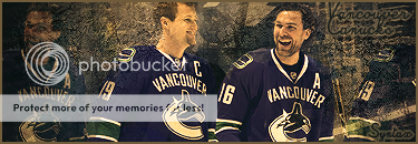
I think it turned out a bit too dark..

SyntaxVC.png

It has been a couple of months since I actually used PS...
 
Syntax said:
I think it turned out a bit too dark..

SyntaxVC.png

It has been a couple of months since I actually used PS...


Anybody care to rate it?
 
Syntax said:
I think it turned out a bit too dark..

SyntaxVC.png

It has been a couple of months since I actually used PS...

Looks good to me, I like the colors you used for it. I assume the golden tint is from a Gradient Map?

The text could be a little better though, perhaps a lighter color and slightly lowering the opacity, and removing that Stroke wouldn't be a bad idea either. I enjoy looking at the middle portion of it, but I'm not sure about the left side. Perhaps if you took the Eraser Tool, and use that faded circle brush (about 60px in size) and set the eraser to about 50% Opacity, and just single click on where that grunge is covering his face. That should help a bit. :)
 
Yeah, I probably should have erased the stock image on the right side of the signature. Thanks for the tips Gikou. I may try working on it again once I have time. I have photoshop installed on another computer. Thus, I can't work with it while I'm on my laptop which is unfortunate.
 
Anyone know if I can get some more fillin tools for gimp ?

The current ones anrt to good
 
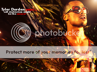
Great c4ds and concept, then it comes to an end.........


Too much text and whats up with the red text ?

I know it's 'supposed' to look like the c4d is going over him but it doesnt. It looks like you soft brushed it :/

Not a fan of the light source nor the skin color.

Lmao, that's right, I said NOR !

Could some gangstas c/c my sig ? XD
 
Last edited:
Back
Top