TortillaChip520
One of the Oceanic 6
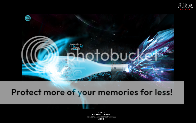
Sneaux125 said:This is the one I wanted to use, but it's 50 pixels over the height limit.
Weak.

that one is a serious 10/10, you just need to cut a bit of the blank space off the top and bottom.
progamer, 6/10
Follow along with the video below to see how to install our site as a web app on your home screen.

Note: This feature currently requires accessing the site using the built-in Safari browser.
Sneaux125 said:This is the one I wanted to use, but it's 50 pixels over the height limit.
Weak.
TortillaChip520 said:that one is a serious 10/10, you just need to cut a bit of the blank space off the top and bottom.
progamer, 6/10

Sparx said:7/10 for Chip? No way! 9/10 the least!
Pro-This one is worse than your last one....5/10.
Sneaux-10/10 for sure! Just do what Chip said.
Btw- Sneaux, of course he could use some work he just started, atleast he is trying to make his own sigs instead of asking people.
At least I make mine. That is all I am proud of.Sparx said:7/10 for Chip? No way! 9/10 the least!
Pro-This one is worse than your last one....5/10.
Sneaux-10/10 for sure! Just do what Chip said.
Btw- Sneaux, of course he could use some work he just started, atleast he is trying to make his own sigs instead of asking people.
pro gamer said:sure why not. where are these tutorials that you speak of?
please don't spam. just stay on topic.titlywink said:so hows ur brother?... fecal matter ahhhh sharp object! choochoo