Navigation
Install the app
How to install the app on iOS
Follow along with the video below to see how to install our site as a web app on your home screen.

Note: This feature currently requires accessing the site using the built-in Safari browser.
More options
You are using an out of date browser. It may not display this or other websites correctly.
You should upgrade or use an alternative browser.
You should upgrade or use an alternative browser.
SOTW #12 Applications
- Thread starter Gymdawg
- Start date
demonflair
Slowly returning..
Close said:My entry:

Check out, how far I improved:

Ryan, it might be your best sig so far imo... that's amazing
Thanks Demonflair, and Syntax !
Syntax looks good, but you could make it really great !
The text " ironman " looks a bit too dark, and can't really see the "i".
Same with Marvel. Me, personally, prefer white text. And imo, I don't like the chrome effect. The border and render looks great.
Syntax looks good, but you could make it really great !
The text " ironman " looks a bit too dark, and can't really see the "i".
Same with Marvel. Me, personally, prefer white text. And imo, I don't like the chrome effect. The border and render looks great.
Byuakuya
Bleach & Heroes fan.
Close said:My entry:
That looks so much better than my attempt Close. Nicely done. I am going to re-do my previous entry and use Beast as the render.
EDIT: This is my final entry. Please ignore the previous (Wolverine) entry:

Last edited:
demonflair
Slowly returning..
Byuakuya said:That looks so much better than my attempt Close. Nicely done. I am going to re-do my previous entry and use Beast as the render.
EDIT: This is my final entry. Please ignore the previous (Wolverine) entry:
Very good, much better than the Wolverine one. Try to sharpen the render more, to come out better in the tag.
Byuakuya
Bleach & Heroes fan.
The blur on the render was intentional. I motion blurred it from the top to give it the effect of a heavy landing (the reason for the flying debris).demonflair said:Very good, much better than the Wolverine one. Try to sharpen the render more, to come out better in the tag.
Thanks for the feedback.
tarheelsuperman
...it gonna be zoppity
Byuakuya said:The blur on the render was intentional. I motion blurred it from the top to give it the effect of a heavy landing (the reason for the flying debris).
Thanks for the feedback.
The motion blur is fine but I think demonflair is right...you need to sharpen the render a bit...if you only do a new layer and apply the image then sharpen and erase around most of the render...I think his face needs more sharpness.
Star Striker
Definately something.
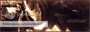
Here's my entry. Not that good but I couldn't find inspiration in this theme:
Star Striker
Definately something.
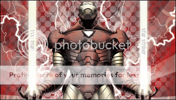
I have another version of it:
Byuakuya
Bleach & Heroes fan.
I personally think that the first one is much better.Star Striker said:I have another version of it:
At Ricardo and Tarheel: Thank you both for the feedback. I will try some sharpening and then post an updated version soon.
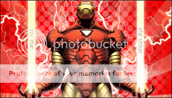
EDIT: Here is the sharpened version:

Last edited:
ssbb_lover
Novocain Stain'd
This should be your entry, and it's nice. Very.Star Striker said:Here's my entry. Not that good but I couldn't find inspiration in this theme:
Pras: MUCH BETTER.
Last edited:
demonflair
Slowly returning..
Byuakuya said:At Ricardo and Tarheel: Thank you both for the feedback. I will try some sharpening and then post an updated version soon.
EDIT: Here is the sharpened version:
Hmm... looks somehow the same... try to sharpen it more. Do this: in the layer that you applied the motion blur filter, erase the render (if it was by applying image), then sharpen the render in a new layer, then add fade sharpen in Edit»Fade Sharpen, then set it to one that will fit better...
tarheelsuperman
...it gonna be zoppity
demonflair said:Hmm... looks somehow the same... try to sharpen it more. Do this: in the layer that you applied the motion blur filter, erase the render (if it was by applying image), then sharpen the render in a new layer, then add fade sharpen in Edit»Fade Sharpen, then set it to one that will fit better...
From looking at it I think if anything needs to stand out and be sharp it's his face. I would work on getting a nice amount of sharpening on there.