Zelda TP Gamecube Hud vs Wii Hud... wha?

White-Wolf

WiiChat Member
Oct 10, 2006
274
0
This is a screenshot showing what the controller dzn hud looks like. Very very nice.

temple01.jpg


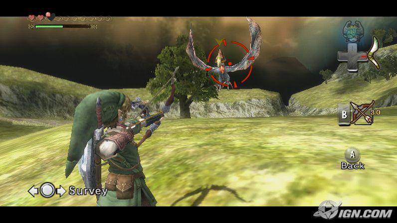
these are some varies hud's for the wii version. Two different ones in fact. Does anyone hope as much as i do that the hud will look as good as it does in the game cube version?

the-legend-of-zelda-twilight-princess-20060914082132755.jpg


http://www.wiichat.com/attachments/...links-running-animation-jump.jpg?d=1160963080

Im pretty sure the two wii huds were tests, just something done quickly with some glamour transparency. it would be a real shame if it looked like this in the final. Anyone have more insight or rumers? the game cube hud gives the game a nice elden feel (I just made up a word) but the wii's hud its kinda like cheap plastic, and only takes away from the game, rather then adding to it. The font in the wii versons also dont look as good side by side with the gamecube zelda. I will still be getting the wii zelda becuse of the gameplay, but I do hope they finish up the hud, and make it look nice old/ancent looking, with lots of little curly dzn's and artnuvo

Let the debate begin.

also looking at it... i ripped the linked image from these boards about his running animation, but if you look, it uses the old controler setup, so the jump animation might have changed.
 
Last edited:
True, Wii does resemble cheap plastic in comparison, but the reason for that would be the layout of the GC controller to the Wiimote. They set out the huds in conjunction to ruffly where the buttons actually are under our thumbs/fingers. It would be a little distracting at 1st maybe for new console users (overall new console users, i.e. people not really used to ANY control scheme never mind Wii), if the 'A' button was shown on the left side of the screen in the bottom corner, while the 'B' was top right corner, and direction pad was mid right hand side of the screen.

With the huds how they are it saves beginners you having to LOOK down at their hands throught their introduction to the game, which could lead to them taking unnecassary hits, etc. Reason your brain sends the control layout map to your fingers/thumbs, and you eventually follow out desired actions quicker and easier by doing so. Same as typing without looking at the keyboard, you learn to do so quicker if you let your fingers find their way and not look at the keys when practicing. The onscreen hud, basically the control pads layout is just there for a prompt when the beginner forgets where a certain button is, or generally needs to see what item is assigned to what button.

I AM aware however you was more or less refering to the design they placed behind the buttons for the GC hud, which is true, they could of put such a pattern around the Wii hud, and maybe they will or have for the final build.
 
Last edited:
  • Thread Starter
  • Thread starter
  • #3
well I also think its a waste of space, as you mentioned. I hope that its fixed because thats bad dzn right their, and its one of those things that was beat into my head at art school never to do. Everything an artist does needs to have dzn and forum, and the game cube version has a really nice feel, while the wii feels cluttered. They could save alot of space by putting the iteam icons overlayed on the button icons like they have for the past. Perhaps this is just traces of bad dzn left over from e3, as the menues could have been more of a tutorial rather then a practical hud.

I do realize the artists might have had time to change the position of icons and make a nice leaf wrap dzn. But its still frightening... :scared:
 
Last edited:
Still to do with a style of a hud so to speak.
The inventory menu screen, I would like to see it layed out in conjunction with Links pouches around his waist. When you go into the menu, the background image is of a pouch, showing the inside, through a cut-out style view, then you have what ever items are in that bag.

Nothing special I know but it gives a sense of realism in storage to an extent. Showing the inside of which ever bag you scroll to (I see two around links waist in the image of him shootin an arrow).
I say to an extent though because we know he hasn't got a bag across his back, so it wouldn't make sense as to where he keeps his iron boots about his person :rolleyes:.

But then again when same kinda thing was done in pokemon ruby/saphire, the hero still pulled a bike... actually two bikes, out the same bag on his back. Although I think they made out like they was types you could fold away for easier storage, he wouldn't be walking around easily with two bikes on his back.

We'll see...
 
Is it wrong that I like the look of the Wii HUD better? The transparent buttons look nice and unobtrusive.
 
Flip said:
Is it wrong that I like the look of the Wii HUD better? The transparent buttons look nice and unobtrusive.

Nothings wrong with your own views because thats what they are, "Each to his own". I actually share your views and like the Wii hud, I prefer though the hud in the image through the link. The icons are smaller and not so in your face, like the ones in the image of Link aiming with the bow.

I think the reason I like the Wii hud is just simply because I cant wait to get it, and know that its something new. And thats the feeling you get off the hud, new, like more modern/futuristic.
Fair enough the GC hud suits the game more because it has a oldish-looking yet nice pattern design around the buttons, and goes witht he sword swinging time-line, but I still like the Wii hud.
 
Last edited:
  • Thread Starter
  • Thread starter
  • #8
yeah, each to his own. I do hope they give the wii version a slight henna dzn feel though. Something that feels like its been curased by a tree.
 
Last edited:
Back
Top