killik119
Quality Control.
Awesome art popert. Can't wait to install photoshop on the new computer, might actually be able to make a sig... not that it'll be good or anything, but it should still be fun.
Follow along with the video below to see how to install our site as a web app on your home screen.

Note: This feature currently requires accessing the site using the built-in Safari browser.
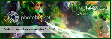
It looks good, but the BG appears to be very busy, taking my view away from Link. Other than that, as mentioned above, the effects around the sword look very cool. Nicely done.Popert said:Probably the animated one...
CnC on my latest... (It's terrible because I don't like Link so I had no will to do it...)
can more peaple answer this question pleasebw! said:which one of my sigs are better

this one ^
or the one i already have
