ssbb_lover
Novocain Stain'd
@ Stevie: That will be quite the task making a sig look good with that render (IMO). :/
Follow along with the video below to see how to install our site as a web app on your home screen.
Note: This feature may not be available in some browsers.

ah crap didnt even notice demon:sick:demonflair said:You caught me there... :lol:
@ Almo, wth!?? And I though that I was going to be the only one using Gambit. :sick:
Bah... whatever... He's cool, and everyone likes him, so there shall be more entries with him...
Almo said:ah crap didnt even notice demon:sick:

Byuakuya said:Here is my entry. I was going for the old comic-book style, but I guess it depends on what you guys think:
demonflair said:Sorry Pras... imo it's not good... it has to many glass filters.

demonflair said:Sorry Pras... imo it's not good... it has to many glass filters.
Thanks for the feedback guys. I will try and change some things around.Close said:As well as too much of color balance.
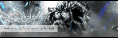
ssbb_lover said:Temp entry. I'm "pleased" with it.
lmao so your basically saying changeeverything but the border and text? lol thats some real deep CC there...demonflair said:It's good, but it's bad... those blue C4Ds are kinda odd, their position is bad. The
light in the top doesn't flow with the render on the left. The grey color is in almost everywhere in the sig, which makes it a bit boring... and the right side of the tag needs more depth.
The text and border are good though.
:lol:Almo said:lmao so your basically saying changeeverything but the border and text? lol thats some real deep CC there...
I like the C4Ds, I like the lights, and if you did something to bring out the render more I wouldn't mind the gray. The only thing I really agree with demonflair on is the depth, though I'm a little surprised demonflair actually told someone they needed more depth *coughtakeyourownadvicecough*demonflair said:It's good, but it's bad... those blue C4Ds are kinda odd, their position is bad. Thessbb_lover said:Temp entry. I'm "pleased" with it.
light in the top doesn't flow with the render on the left. The grey color is in almost everywhere in the sig, which makes it a bit boring... and the right side of the tag needs more depth.
The text and border are good though.
Gymdawg said:though I'm a little surprised demonflair actually told someone they needed more depth *coughtakeyourownadvicecough*

