iRAWR
rawrrr
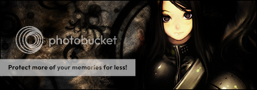
woah..am i the only one who ALWAYS usues tuts..when making sigs O.O
Follow along with the video below to see how to install our site as a web app on your home screen.
Note: This feature may not be available in some browsers.
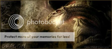
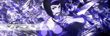
Byuakuya said:It is a little dark, but it is pretty cool overall. A few pointers:
- The text is a little hard to read. Maybe a brighter colour will make it stand out a little.
- Try adding some sort of a light source and see if that makes any difference.
- The addition of some C4Ds will also make it stand out more.
That's all I can think of. Nicely done.")


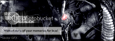
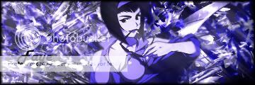
 I suggest changing the font though, perhaps to something more blocky-looking and darker (black font). Same with your Sprite Tag. The red brushes you used are a big overpowering, and you can barely see the character in the middle.
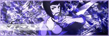

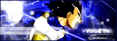
auxidize said:demonflair- Not bad, yet it's a tad on the plain side.
Monsteroids- Very nice
Here's a couple simple ones of mine. Some of my other blends are too big.
RAW blend, so no brushes/textures added. Bad quality, I know, but that blend was made last year. I haven't photoshopped in quite a while.
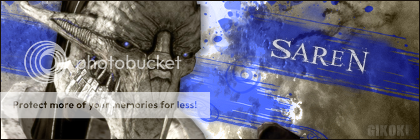
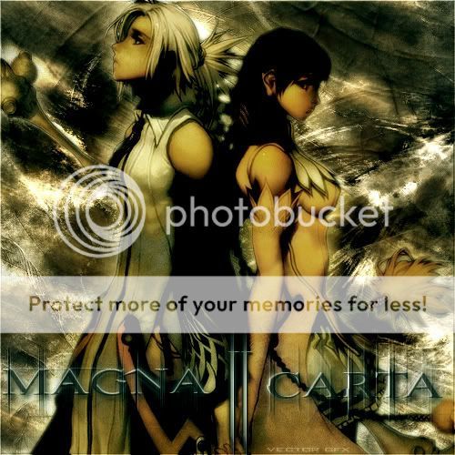
The let side of that sig is great. I really like that bg + blurred text over it. Lighten up the right side of the sig and make more of a contrast.Gikoku said:My new sig:
Experimented with some advanced techniques involving the smudge & burn tools for this one.. I could have done much better if I had better brushes though. I usually don't do really dark pieces (color-wise)..
Ah well, is there anything you guys think should be improved on?
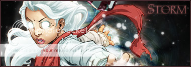
Very nice, Ricky.Demonflair said:
ssbb_lover said:The let side of that sig is great. I really like that bg + blurred text over it. Lighten up the right side of the sig and make more of a contrast.
Very nice, Ricky.

demonflair said:Gikoku, for how long have you been working with PS? You show potential with that sig.
I mean, the bg is very good for a newbie (?). The composition, the contrast, the effects, text and lighting match very well. It only needs work on colors, but still very good stuff.


Thanks, bud. :-D Consider it worn.demonflair said:Thanks mate.
You can wear it if you want.
Byuakuya said:That is a very nice collection there Gikoku. Nicely done.