Foxy
Super Ninjarator
- Apr 4, 2007
- 6,677
- 105
- Wii Online Code
- 3881-9484-9041-5848
Celeste said:I made my first videogame-related sig!")
'Pwns' anything I could do
Edited my previous sig which you all preferred:

Follow along with the video below to see how to install our site as a web app on your home screen.

Note: This feature currently requires accessing the site using the built-in Safari browser.
Celeste said:I made my first videogame-related sig!
That looks very nice for a first piece. Nicely done.Celeste said:I made my first videogame-related sig!
I personally prefer the piece on the right. You should enter that one as your SOTW entry.Syntax said:I got bored... Very basic... Could use a lot of work..

Syntax said:I got bored... Very basic... Could use a lot of work..
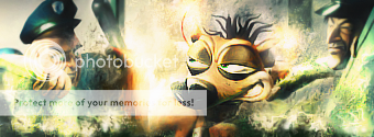
It looks like the squirrel from the Lion King films, but I could be wrong.Syntax said:Who is that character in the second one. For some reason it seems familiar. Oh and very nice work, keep it up.

Nice choice of font. Here are a few tips:Wii_Smurf said:Im back, After so long without a Sig.
I've been making mini Animations recently and so my latest sig Sucks.
Need advice on tweaking really

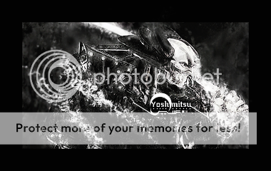
It is a little dark, but it is pretty cool overall. A few pointers:Gikoku said:My new sig:
Experimented with some advanced techniques involving the smudge & burn tools for this one.. I could have done much better if I had better brushes though. I usually don't do really dark pieces (color-wise)..
Ah well, is there anything you guys think should be improved on?