Popert
Banned
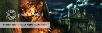
Really nice. Messy, in a good way... I can't really see a light source but I don't have my contacts on either...
C&C on latest work:
C&C on latest work:
Follow along with the video below to see how to install our site as a web app on your home screen.
Note: This feature may not be available in some browsers.


It's love <3Darkprinny said:
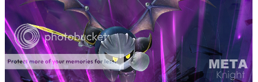
A recent sig I made for Wiired


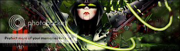
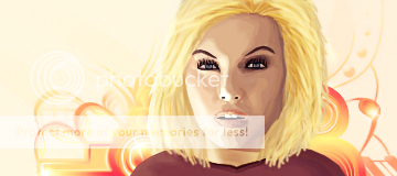
That is one of the best Sigs that I have ever seen. To top it off, I love the fact that it looks like it features Koda Kumi. Nicely done.demonflair said: