Smashfreak
~nightly Angel~
- Dec 1, 2007
- 20
- 0
Could you rate und comment on my signature?
This would be really nice.
This would be really nice.
Follow along with the video below to see how to install our site as a web app on your home screen.
Note: This feature may not be available in some browsers.
It is great to have you back.Popert said:Hello, I am back :lol: I'm a bit rusty but I am currently working on a signature...
The Sig is great for a simple piece, but I am sure that you can improve it by following some tutorials as well. Overall, nicely done.Smashfreak said:Could you rate und comment on my signature?
This would be really nice.


Apart from the random spots to the left, it looks very nice.Sneaux125 said:
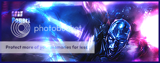
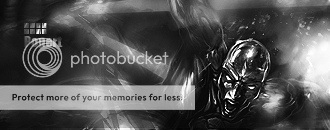
A recent sig I've made. c&c