Official Graphics Comments & Criticism

Sneaux125 said:
I actually very rarely use brushing. Only when I make a vector sig will I whip out the brushes, and that isn't very often since I suck at vector sigs

I don't brush that much, only made one vector sig.
 
Hurrah for CS2. :) I heard CS3 was quite confusing which is why I didn't [STRIKE]rip[/STRIKE] buy it. Plus, I don't have the extra time for Photoshop when I spend every last spare second I have on here, so it's not really worth it.
 
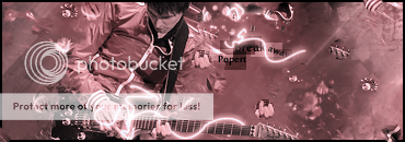
I would suggest trying to go in a different direction with the text, only because it seems the same in every sig. :) A bit plain, but it makes your render glow nicely. I like it. :-D
 
ssbb_lover said:
I would suggest trying to go in a different direction with the text, only because it seems the same in every sig. :) A bit plain, but it makes your render glow nicely. I like it. :-D
Yeah, I have been using the same text style for the past few Sigs now. Thanks for the feedback, I will change it on my next one. :)
 
Thanks :p

Latest:
V1
Breakaway.png

V2
Breakawayfiltercopy.png

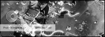
V3
BreakawayBW.png

I love it personally! :p
CnC?
 
Last edited:
Sneaux125 said:
I just made my second vector sig ever, I'm on my PS3 now, so I'll post it as soon as possible

My pathetic attempt at a vector sig -

sig198.png


criticism is very welcome =p

And Popert, I like everything about your newest sig except for the pen tooling around his hand on the guitar. It's just a bit too messy. But other than that, I love it =D
 
Thanks^^^
And that Vector sig I really don't like, no offence. The colors don't really match, and it just doesn't seem very high quality. No depth really... :p But with a different stock it could look really good!
 
Back
Top