Popert
Banned
Lol, I don't want to get into the arguement, but, I'm not sure exactly what vector really is...
Follow along with the video below to see how to install our site as a web app on your home screen.

Note: This feature currently requires accessing the site using the built-in Safari browser.
 even if that post wasn't towards me! :lol:
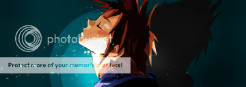
Close said:Dude, there's millions of vector sigs with a light source:


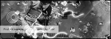
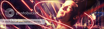
Popert said:Latest:
V1
V2
V3
I love it personally!
CnC?
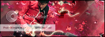
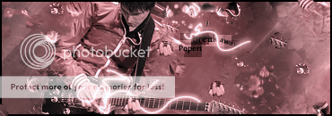
Sneaux125 said:2 Newest -

and
Close said:The first one doesnt have a great bg, partly because the render takes up the majority of the sig.
The second sig has bad brightness/contrast on the top of the render.