
ssbb_lover
Novocain Stain'd
As the title implies, this tutorial is only compatible with Photoshop versions 7 through CS3, know that before starting (the techniques taught in this tutorial can also be applied to GIMP).
1) Open a new document. I use 400x130, but it’s up to you. I recommend not getting too much bigger (or smaller), just keep it around those dimensions. Color the canvas black (make your secondary color black and hold SHIFT+BACKSPACE).
2) Choose a render, particularly this render so that you can get the closest results. Once you do the tutorial through with this render, try doing it with another render and see what you come up with. (Click the Link) http://planetrenders.net/renders/displayimage.php?pos=-3382
3) Now, duplicate the render (Click on the render layer and hold CTRL+J) and Gaussian Blur it 8.6 pixels. Set the layer’s Blending Mode on Linear Dodge and take out your eraser. Just make it a nice round soft brush and make the size 74 pixels and the opacity 50%, then just click right on the nose of Naruto ONCE, no more.
4) Now, duplicate the Naruto render 4 times, making sure they’re all set in front of the black filled layer, but behind your two beginning render layers, then move them around so that they cover up the entire black layer. So this is what your layer window should look like:
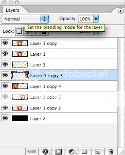
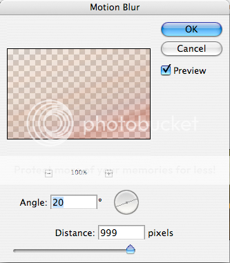
Now, combine the four new render layers into one layer (highlight the 4 layers by holding SHIFT and clicking on all 4 of them, then go Layer > Merge Layers). After combing them, go to Filter > Blur > Motion Blur and have these settings.
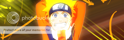
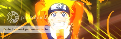
5) Ok, now we’re going to make some brush strokes, start by creating a new layer above the Motion Blur you just finished. You won’t be able to make anything very cool with the default brushes that are already uploaded into Photoshop, so go download some of your own. Just go to g00gle and type in “Photoshop Brushes”, you will most likely find a site that has tons of different types of brushes and you can preview what they look like (types are grunge, tech, abstract, C4D, etc.) Try using colors from your render, the easiest way to do this is by pressing the “I” key, which should provide you with the “eyedropper” tool. Once obtaining the “eyedropper” tool, click on the original render layer, then click on Naruto jacket, hair, eyes, etc. and then you know for sure that the colors you’re getting are from the render! Here’s what I got.
NOTE: Make sure yours doesn’t look EXACTLY like mine, it’d be hard considering you’d have to find the same brushes and everything, but still, be creative. Just don’t make it too busy, see how my brush strokes are very simple.
6) This is pretty unheard of in Beginner’s tutorials, but i’m going to ask you to add a C4D. Now i’ll tell you how to do it, so don’t worry, but if this becomes too tough, THIS IS NOT NECESSARY, it’s an optional step.
Here’s the C4D I used. (Click the Link) http://planetrenders.net/renders/displayimage.php?pos=-409
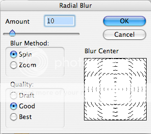
I suggest signing up for Planetrenders, as it is a enormously helpful site, and it’s the only way to get the enlarged version of the image in that link. After signing up, click on my link again and click on the image, copy the enlarged version of the C4D and open a new document in Photoshop (When you go File > New, the dimensions will already be correct for the image you last copied). Paste the C4D in this new document and select the Polygon Lasso tool, then select the following part and color the white with black (click on the paint bucket tool, set the primary color to black, then click on the white inside the selected area). Copy this and then go back to your sig. Paste this onto your sig and set it to linear dodge, then duplicate the layer (CTRL+J) and on this new layer go Filter > Blur > Radial Blur, set the settings as follows.
Erase some of the original C4D layer and it should look a bit as follows.
7) ALMOST DONE! Ok, now i’m going to give you 3 options for finishing this sig, but don’t just try one and say, “OMG I LUV IT I’LL JUST QUIT!” Try all of them so that you have these three techniques stored in your brain for future use.
Border #1) Open a new document with the dimension of 400x6. Fill this document with black using the same technique you did in the beginning of the tutorial, then select the whole thing (CTRL+A) and copy it. Go back to your sig and paste your black 400x6 object, then click on your move tool. Don’t move the black rectangle manually (by clicking and dragging), instead hold shift and use the arrow keys till it’s at the top of your sig, then paste the rectangle again and move it to the bottom. It should now look like this.
Border #2) Create a new layer and select all (CTRL+A), then go Edit > Stroke. Have these settings.
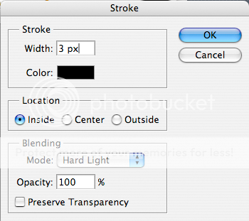
Now go Edit > Stroke again, but this time set the width to 2 pixels and the color to white. Now do Edit > Stroke AGAIN and make the width 1 pixel and the color black. Set this layer to Overlay and you have border #2.
Border #3) Go to Layer > Flatten Image first off. Now simply right click on the shape tool (the tool under the text tool which is signified by a large “T”) and click on the “rounded rectangle tool. Line up the cross of the tool so that the line butting out the bottom and the line butting out to the right so that it lines up with the top right corner of your sig. Now click and drag to the bottom right corner so that it looks like this.

Note that you can still see the corners of the sig under this large black rounded rectangle.
Now, hold shift and click on the rounded rectangle layer (you should have two layers, one of them being all of your layers that you had now flattened and the other should be your rounded rectangle), by doing this the rounded rectangle should be selected. With this area now selected, click on your flattened image layer and say CTRL+C. Hit CTRL+V now and delete the other two layers, it’s not as obvious in Photoshop, but when you show it on a forum or what not you will see that the corners have been rounded off, this can act as a border. Here’s what it should look like.
Congratulations! You have now learned how to make a reasonably acceptable sig! :] I hope you enjoyed this tutorial as much as I worked my ass off making it! Thank you and goodnight....
- Tyler
1) Open a new document. I use 400x130, but it’s up to you. I recommend not getting too much bigger (or smaller), just keep it around those dimensions. Color the canvas black (make your secondary color black and hold SHIFT+BACKSPACE).
2) Choose a render, particularly this render so that you can get the closest results. Once you do the tutorial through with this render, try doing it with another render and see what you come up with. (Click the Link) http://planetrenders.net/renders/displayimage.php?pos=-3382
3) Now, duplicate the render (Click on the render layer and hold CTRL+J) and Gaussian Blur it 8.6 pixels. Set the layer’s Blending Mode on Linear Dodge and take out your eraser. Just make it a nice round soft brush and make the size 74 pixels and the opacity 50%, then just click right on the nose of Naruto ONCE, no more.
4) Now, duplicate the Naruto render 4 times, making sure they’re all set in front of the black filled layer, but behind your two beginning render layers, then move them around so that they cover up the entire black layer. So this is what your layer window should look like:
Now, combine the four new render layers into one layer (highlight the 4 layers by holding SHIFT and clicking on all 4 of them, then go Layer > Merge Layers). After combing them, go to Filter > Blur > Motion Blur and have these settings.
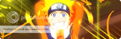
5) Ok, now we’re going to make some brush strokes, start by creating a new layer above the Motion Blur you just finished. You won’t be able to make anything very cool with the default brushes that are already uploaded into Photoshop, so go download some of your own. Just go to g00gle and type in “Photoshop Brushes”, you will most likely find a site that has tons of different types of brushes and you can preview what they look like (types are grunge, tech, abstract, C4D, etc.) Try using colors from your render, the easiest way to do this is by pressing the “I” key, which should provide you with the “eyedropper” tool. Once obtaining the “eyedropper” tool, click on the original render layer, then click on Naruto jacket, hair, eyes, etc. and then you know for sure that the colors you’re getting are from the render! Here’s what I got.
NOTE: Make sure yours doesn’t look EXACTLY like mine, it’d be hard considering you’d have to find the same brushes and everything, but still, be creative. Just don’t make it too busy, see how my brush strokes are very simple.
6) This is pretty unheard of in Beginner’s tutorials, but i’m going to ask you to add a C4D. Now i’ll tell you how to do it, so don’t worry, but if this becomes too tough, THIS IS NOT NECESSARY, it’s an optional step.
Here’s the C4D I used. (Click the Link) http://planetrenders.net/renders/displayimage.php?pos=-409
I suggest signing up for Planetrenders, as it is a enormously helpful site, and it’s the only way to get the enlarged version of the image in that link. After signing up, click on my link again and click on the image, copy the enlarged version of the C4D and open a new document in Photoshop (When you go File > New, the dimensions will already be correct for the image you last copied). Paste the C4D in this new document and select the Polygon Lasso tool, then select the following part and color the white with black (click on the paint bucket tool, set the primary color to black, then click on the white inside the selected area). Copy this and then go back to your sig. Paste this onto your sig and set it to linear dodge, then duplicate the layer (CTRL+J) and on this new layer go Filter > Blur > Radial Blur, set the settings as follows.
Erase some of the original C4D layer and it should look a bit as follows.
7) ALMOST DONE! Ok, now i’m going to give you 3 options for finishing this sig, but don’t just try one and say, “OMG I LUV IT I’LL JUST QUIT!” Try all of them so that you have these three techniques stored in your brain for future use.
Border #1) Open a new document with the dimension of 400x6. Fill this document with black using the same technique you did in the beginning of the tutorial, then select the whole thing (CTRL+A) and copy it. Go back to your sig and paste your black 400x6 object, then click on your move tool. Don’t move the black rectangle manually (by clicking and dragging), instead hold shift and use the arrow keys till it’s at the top of your sig, then paste the rectangle again and move it to the bottom. It should now look like this.
Border #2) Create a new layer and select all (CTRL+A), then go Edit > Stroke. Have these settings.
Now go Edit > Stroke again, but this time set the width to 2 pixels and the color to white. Now do Edit > Stroke AGAIN and make the width 1 pixel and the color black. Set this layer to Overlay and you have border #2.
Border #3) Go to Layer > Flatten Image first off. Now simply right click on the shape tool (the tool under the text tool which is signified by a large “T”) and click on the “rounded rectangle tool. Line up the cross of the tool so that the line butting out the bottom and the line butting out to the right so that it lines up with the top right corner of your sig. Now click and drag to the bottom right corner so that it looks like this.
Note that you can still see the corners of the sig under this large black rounded rectangle.
Now, hold shift and click on the rounded rectangle layer (you should have two layers, one of them being all of your layers that you had now flattened and the other should be your rounded rectangle), by doing this the rounded rectangle should be selected. With this area now selected, click on your flattened image layer and say CTRL+C. Hit CTRL+V now and delete the other two layers, it’s not as obvious in Photoshop, but when you show it on a forum or what not you will see that the corners have been rounded off, this can act as a border. Here’s what it should look like.
Congratulations! You have now learned how to make a reasonably acceptable sig! :] I hope you enjoyed this tutorial as much as I worked my ass off making it! Thank you and goodnight....
- Tyler
")