
here are some of the worst box arts from this past year as chosen by gamesradar ")
haha i hope you liked this find, have a nice day
source- http://www.gamesradar.com/us/ps2/game/features/article.jsp?articleId=20071211165037654003&releaseId=20060331143728168090§ionId=1003&pageId=2007121116537488065
seriosuly though...........
WHAT THE HELL
Take a look back at the 15 games that fuglied up store shelves the most this year
Designing a box for a game is tough. With one image, you need to stand out on the shelf, catch the eye of the casual consumer and convince them that your game is worth their money. Some games get it wrong; others get it so wrong that potential customers actually recoil in horror. We've all seen terrible old atrocities like Mega Man and Alex Kidd in Miracle World, but don't think for a second that awful cover art is a thing of the past, left behind by a more sophisticated games industry. To prove it, we've pulled together the 15 worst examples from this year alone for you to gawk at.
Please bear in mind we're not passing judgment over the games themselves - just the boxes that hold them.
15. Fairy Godmother Tycoon (PC, released April 30
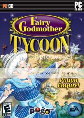
Compositionally, there's nothing wrong with this Shrek 2-inspired box and its frog-lipped, cake-haired, cow-eyed matron - apart from the fact that it exists.
14. Etrian Odyssey (DS, released May 15)
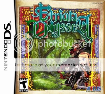
Shh! These characters were posing, but then a loud noise startled them into hiding on the far side of the cover. Maybe if we're real quiet, they'll slowly creep back and help us figure out how to read their logo.
13. Nancy Drew: The White Wolf of Icicle Creek (PC, released June 7)
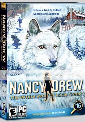
Also known as "Nancy Drew: The Painting on the Side of the Van Owned by the Middle-Aged Man Who Wears a Turquoise Belt Buckle and Collects Dreamcatchers."
12. Petz: Catz 2 (PC/PS2/Wii/DS, released Nov. 15)
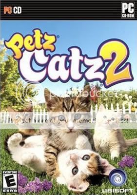
"O HAI U CATCHED US SECKSING LOL."
We honestly don't know what's worse - the fact that these kittens are clearly getting it on, or the way they're making eye contact with us the entire time.
11. Touch Detective 2 ½ (DS, released Oct. 9)
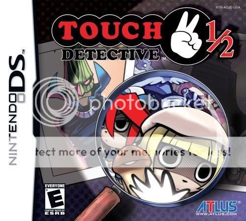
Um...
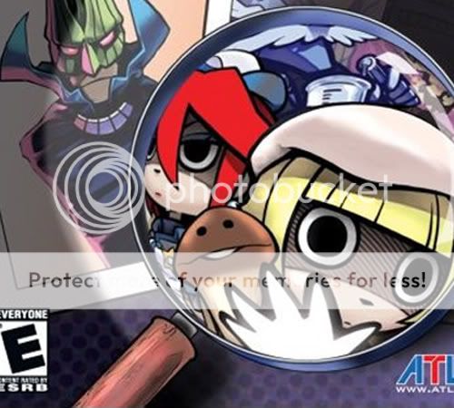
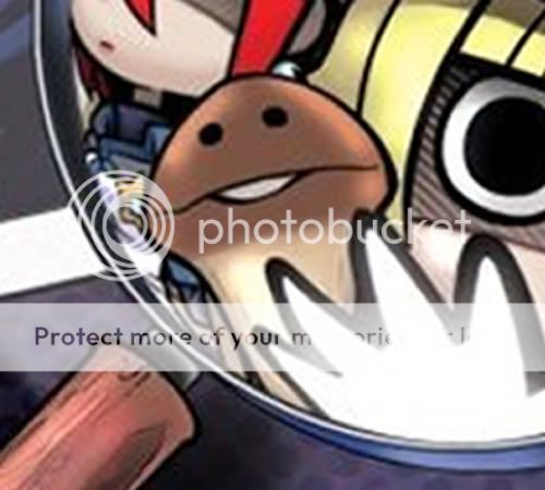
what!?
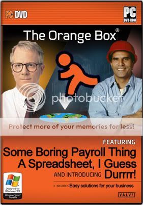
10. The Orange Box (PC/360/PS3, released Oct. 10)
This one's a special travesty, because The Orange Box is arguably the single best videogame product released this year - but publisher EA decided to shovel it into a box that's impossible for anyone but a dyed-in-the-wool Half-Life fan to get excited about. The weird, action-free compromise between minimalist design and chunks of character art comes off looking like nothing so much as a piece of productivity software, designed to catch the eye of balding men in ties and shirtsleeves at an office-supply store. To illustrate what we mean, here's what The Orange Box looks like through the eyes of someone who doesn't follow the game industry and glances at it on a shelf:
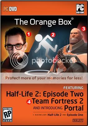
Software guru/Norton Utilities spokesmodel Peter Norton (with a beard)
Product logo, or possibly an indicator that AOL Instant Messenger is included
"Regular guy" with knowing grin who uses this product to facilitate his small-business operations
A bunch of boring words in a decidedly non-awesome font
Or, to put a finer point on it:
9. Carnival Games (Wii, released Aug. 28)
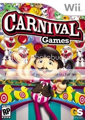
You know how, when you die, your friends and family appear and coax you toward a bright light? Yeah, this giant-clawed carnie and his leering gallery of awful are the last thing you'll see after you've reached it. This is what we call "bait and switch."
8. Mercury Meltdown Revolution (Wii, released Oct. 5)
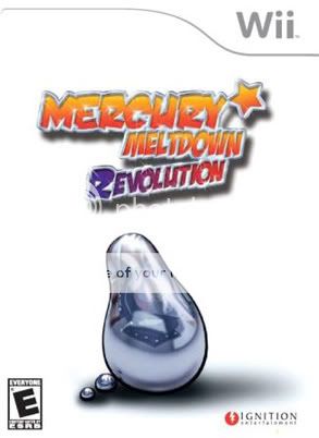
We know the kids love to play with mercury, but putting a pear-shaped blob on the cover of your game alongside nothing else probably isn't the best way to get people to fork over their cash. On the other hand, it's still a better idea than trying to use designer Archer Maclean's name to sell the thing.
7. Billy the Wizard: Rocket Broomstick Racing (Wii, released Sept. 28)
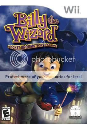
"Oh, jolly good! I do believe I see Harry Potter down there! Quickly, wand - Accio coattails!"
6. John Deere Harvest in the Heartland (DS, released Nov. 20)
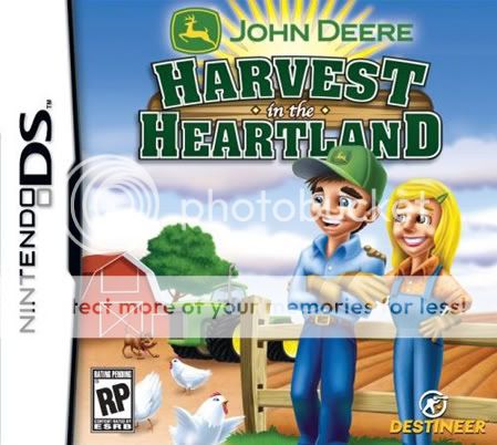
The direction here seems to have been, "make it look like Harvest Moon, only boring, hideous, Fisher Price-y and more reflective of cornfed Middle American values. Oh, but keep the big eyes. The kids like big eyes, right?"
UPDATE: Publisher Destineer has dropped us a line to let us know that the above image is not, in fact, the final box art for Harvest in the Heartland, and has asked us to please hate the following box instead:
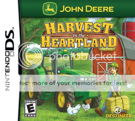
We applaud them for being good sports, but come on - that box is nowhere near as horrible. Although we do wonder what happened to the farmer's wife. And also what's in that suspiciously heavy hay bale...
Holy crap, we're buying this right now.
5. Counter Force (Wii, released Oct. 3)
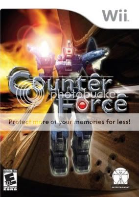
Art intern: Is this stupid robot seriously the only piece of art they sent us?
Art director: Well, no. They also sent us a render of a huge, throbbing penis. But putting that on the cover translates to poor sales in certain parts of the country.
Art intern: So what do you want me to do with it?
Art director: Just put a big lens flare on it somewhere and let's call it a day.
Art intern: Are you sure? I could do, like, a stylized outline, or…
Art director: You think you're too good for lens flare, you little son of a *****?
Art intern: Wha-
Art director: (Punching noises)
4. American Girl: Julie Finds A Way (DS, released Dec. 3)
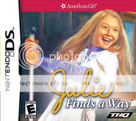
You think this image is innocent? Lighthearted? Yeah, no. See that giant lever? It's dumping a gallon of pig's blood all over Carrie right now. And Julie is laughing. But she'll see. Oh, soon they'll all see.
3. Trauma Center: New Blood (Wii, released Nov. 20)
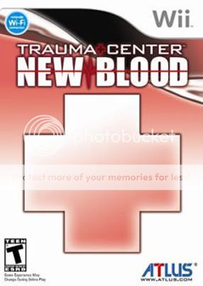
To the casual observer, this game is either about very basic math or about a game publisher getting hauled into court for stamping the Red Cross logo on its product. Either way, a box that features nothing whatsoever to get excited about is not a box for which we're going to fork over $50.
2. OMG 26: Our Mini Games (DS, released Oct. 30)
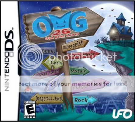
Hmmm... "Books," "Rock" or "Buy Something Else?" Decisions, decisions...
1. Monster Trux Arenas: Special Edition (Wii, released Sept. 25)
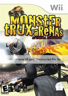
This is, without a doubt, the worst cover we've seen all year. There's no central image, and we don't get a clear look at anything except truck undercarriages. The logo was spelled by an idiot, "aReNAs" is needlessly intercapped and there's no good goddamn reason for another monster truck to be perched on top. Looking at this feels like a redneck is vomiting trucks into our eyeballs. We can even hear him bellowing his approval of the trucks and their actions between heaves. Effing atrocious.
haha i hope you liked this find, have a nice day
source- http://www.gamesradar.com/us/ps2/game/features/article.jsp?articleId=20071211165037654003&releaseId=20060331143728168090§ionId=1003&pageId=2007121116537488065
seriosuly though...........
WHAT THE HELL