Back in the days before the internet existed to help you decide which games were worth your hard-earned cash/not-at-all-earned allowance, gamers often had to resort to judging a game's merits from its box art. That meant the cover had to be the most enticing piece of advertising ever so that imaginative young minds could see themselves taking their place beside Han Solo or taking home the bikini girl on the front of Barbarian. But the experience seldom lived up to that promise.
So we've trawled the archives to bring you the finest examples of box art that oversold the experience. Take a look, see them all, then have a laugh/cry over what we used to spend our time and money on. And how foolish we were to get sucked in by this sort of thing:
1.
Spider-Man (Atari 2600, 1982)
Box art suggests: Spider-Man takes on the Green Goblin, slinging webs that can be sliced by a foe's attack while climbing up a skyscraper, dicing with death during this perilous ascent.
The reality: A mess of squares and colours. And a Spider-Man sprite with (apparently) no neck. Try not to laugh at it, it was probably good at the time.
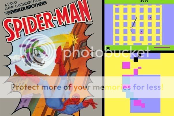
Above: Spider-Man's had his head cut off by a new foe - primitive technology. The fiend!
2.
Virtua Racing (Mega Drive, 1994)
Box art suggests: Detailed, glorious 3D racing - this is like the 180,000 polygons a second of the Model 1 arcade stunner in your house.
The reality: 500 polygons a second, maximum. For the entire game. It was still great for the humble Mega Drive/Genesis and we played it to death, but we do remember picking up the box and looking from it, to the screen and back again and wondering why the two looked so different.
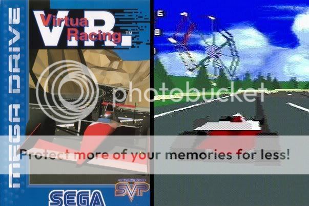
Above: Love the arcade version? Buy this. Look, it's sort of the same...
3.
Barbarian/Death Sword (Commodore 64, Amiga etc, 1987)
Box art suggests: A Page 3 Girl (Maria Whittaker) in a teeny, tiny bikini, with macho muscles and weapons for the hero (played here by Wolf from Gladiator). All set in a backdrop apparently borrowed from Buffy the Vampire Slayer.
The reality: Hand-drawn sprites crudely representing both muscle-man and bikini girl. And yes, her bikini is tiny, but '20 pixels big' wasn't quite the kind of skimpy we had in mind
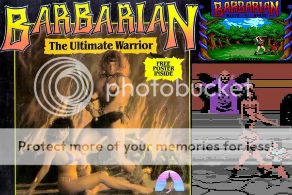
Above: The promise of a poster was the clincher for many a red-blooded teenager. At least that one didn't disappoint
4.
World Cup Italia '90 (Sega Mega Drive, 1989)
Box art suggests: All the glory of the greatest football tournament on the planet, with all the passion, excitement and spectacular goals of the real thing.
The reality: Perhaps the worst soccer game ever made. No licensed names, no formation settings... not even fouls. We're so glad we don't have to endure tripe like this any more.
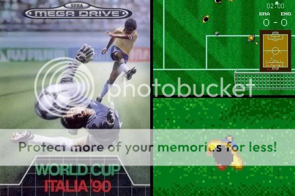
Above: Look how great football is! Then forget everything about it and play this shambles
5.
Mario & Yoshi (Game Boy/NES 1991)
Box art suggests: Another classic platformer featuring the timeless partnership of two of Nintendo's best-loved characters with all their classic foes making an appearance.
The reality: It's a puzzle game. The only 'platforms' are plates that Mario switches round to stack up themed blocks. While Yoshi is pictured at the side. For some reason. Can we have our money back, please?
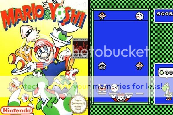
Above: Wouldn't anyone logically assume this should be a platformer?
6.
Star Wars: The Empire Strikes Back (Atari 2600, 1982)
Box art suggests: A recreation of the Battle of Hoth, where you can take down the AT-ATs on your TV. It's got to be amazing.
The reality: You pilot a blue blob. You fly left. You encounter a mass of squares in the vague shape of an Imperial Walker. You shoot it. Sometimes it fires a heat-seeking missile at you (er... just like the film?). It flashes and disappears. You fly left again and... repeat. Tripe.
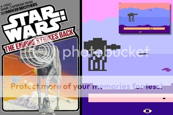
Above: We know graphics technology was embryonic, but if you put these visuals on the front of the box, would anyone have bought it? Even a Star Wars fan?
7.
Sword of Aragon (PC, 1990)
Box art suggests: Ferocious battle in a beautiful world, with hundreds of enemies on screen, like Ninety-Nine Nights.
The reality: A rather basic isometric strategy game. We would feel robbed if those horse sprites weren't so damn cute. But look - 'quit' is an in-game option!
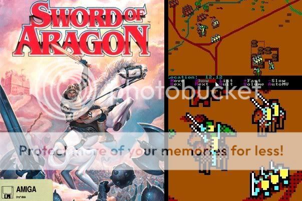
Above: Imagination is a great thing. So this sort of thing looked like the boxart. In our minds
8.
Kikstart 2 (ZX Spectrum, 1988)
Box art suggests: Frantic motorbike action with dirt, lights and cones to knock over/weave through.
The reality: Side-scrolling crapness. Admittedly, it does have the promised course design mode, but we seem to remember that crashing whenever we tested its limits. And if you fell down the wrong hole, you couldn't get out again. Those were the days...
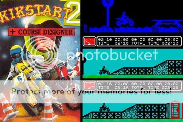
Above: The cover would have appealed to any young lad growing up in the '80s. The game? Meh
9.
Hero Quest (ZX Spectrum, 1991)
Box art suggests: Fearsome warriors taking down hordes of fantasy monsters in a game packed with magic, beards and knights in dark armour.
The reality:It's a board game. Y'know, like the board game. With a few colours and weedy sprites. But we do remember the staircases looking good. Does that help?
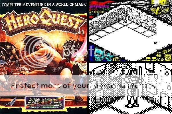
Above: Our parents told us: "£7.99's far too much for a computer game - we'll never pay that much for one again, OK?" Ah, the naivety
10.
Battle Chess (Atari ST, 1989)
Box art suggests: Chess with the most beautifully-realised graphics you've ever seen. And the queen is hot.
The reality: Well... it wasn't awful. It was, however, extremely slow. Animations had to load and then played out for what seemed like an eternity. They looked good for the time, but it's hard to be as dramatic and naturalistisc as the cover art when you have to load a second disc just for the animations.
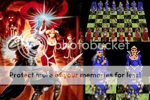
Above: The king looks ancient. If that's the queen... well, he's done well for himself
haha i hope a couple of these gave you a good laugh, i loved the spider man one, haha
courtesy from the boys at www.gamesradar.com
")


