ssbb_lover
Novocain Stain'd
- Thread Starter
- Thread starter
- #3,751
West = Left. East = Right.
:3
:3
Follow along with the video below to see how to install our site as a web app on your home screen.
Note: This feature may not be available in some browsers.
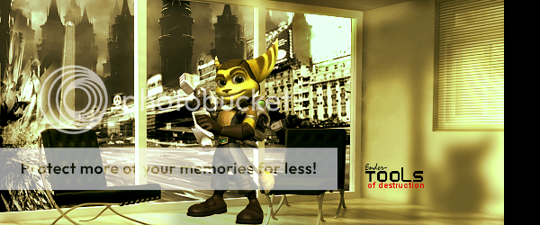
You're DEFINITELY getting better, Jam. I like the 1st one, however you need to work on the text. Too much negative space on the right side, it seems as if the effects flowing from the left just got cut off with a brush or something. Light source is good on the render, but it doesn't seem to take place throughout the rest of the sig.Cpt.McCloud said:Ohhhhhhhhhhhhhhhhhhhhhhhh

and

C&C this please my little dumpings!


ssbb_lover said:Haha, nice, Prinny.
*EDIT*
Latest, for SOTW.

Cpt.McCloud said:Ohhhhhhhhhhhhhhhhhhhhhhhh

C&C this please my little dumpings!
Gikoku said:I kinda like this one, the effects and swirls are nicely done. It also has a nice balance between the light & dark areas, but it's just too monochromatic for my tastes. You should try experimenting with Gradient Maps (If you're using Photoshop), get a nice mixture of colors in there that blend well with each other. The text is alright, but I don't fancy Italics too much in many sigs, and it's placement helps distract from the entire flow of the rest of the sig. Change the location of the text (perhaps somewhere closer to the render), and lower the opacity of it a little bit, you can also try rotating it to match the direction of the background effects..
Sneaux125 said:New experiment (made using 4 different stocks, 2 different c4ds, and of course that render...also my second semi-LP) -


I am just going to repeat what Tyler already mentioned, but you have really improved and you are continuing to do so with every piece. I prefer the first piece over the second and agree with Tyler about the fact that the piece will look a lot better if that negative space on the right was filled with some sort of an effect or C4D.Cpt.McCloud said:Ohhhhhhhhhhhhhhhhhhhhhhhh

and

C&C this please my little dumpings!
thanks syntax!!Syntax said:Instead of double posting just use the edit button. I'll critique the work after...
1. Download more fonts at www.dafont.com
2. Try to blend in your renders by messing around with various effects.
3. If you find that the render that you'd like to use isn't blending in so well just copy that image layer, go filter sharpen > sharpen and then set the layer on overlay and change the opacity if needed.
4. Try using renders from www.planetrenders.net
5. If you're going to use other images in the signature as well, try to make it so that they blend in with the rest of it.
6. Check out the "Design Lounge Library" for links to various user made tutorials here at WiiChat. Also try checking out ssbb_lover's humongous gfx thread.