Art thread

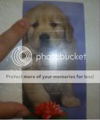
More erm...cheek shadow, just to force a BIT of cuteness.... I'd like to midly tweak it in PS to give you an idea of what I mean.

Otherwise I love it man!

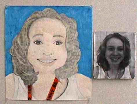
I like the scene you are putting it into. Awesome stuff.
 
Holy crap. You sure pulled this one off. Wowowowow.
...But I liked the fat legs in the first one. xD

I love it. I love the whole composition of where you placed everyone, and their facial expressions are just brilliant. I love the way you work on faces, particularly the lips. You've added so much character into this piece it makes me so damn jealous of you. I don't know how you thought this all up. I'll just keep staring at it forever. Damn. Also, how did you do that floor with such a low grade program?
 
Wow, thanks for the compliments, Frogger. =] Yeah, I'm really going for personality in this one.

EDIT: Anyway, I wouldn't be too amazed at the floor since I didn't do much to make it. Right now, it's just basic black vector lines and a transparent filter over a white-brown gradient.
 
Last edited:
Ahhh pull her cheeks up man!

Youve given her old woman jowls.

And she needs more chin, her face looks too droopy.
 
Thanks, DR.MARIO. =D

Faultless, eh? Well, I think I could work on her face a bit. Gotta make sure she's actually looking like a girl.

As for your picture, the face doesn't look bad so far. All the proportions seem to be there. I think you need to continue shading her entire face. The cheek muscles look awkward partially because the bottom of her face has no shading on them. If you have a uniform base tone, the detail of the cheek muscles will look more natural.

I think after the whole face is shaded, you may wanna adjust how strong you make those cheek muscle details. They could also be too pronounced for what you have rendered on the paper.

Eyes don't look bad to me. The bottom contours of each eye are very dark and thick, though, which is giving me that old woman vibe. I think for now the eyes are the least of your worries. You should work on the rest of the face and then go back and play with the shading of the eyes. Hair is also drawn accurately, though the shading isn't making sense.

Anyway, it's looking promising so far. Keep us updated on the progress! And lol @ the room taking up half of the photo. :lol:
 
Last edited:
Bio, faultless as always.

--

Her eyes and cheeks are doing my pissing head in :


Still working on absolutely everything on this. Hell of a lot to do, still need to finish the hair (T'ank you again, Emma).

But...yeah..I think I've finally sorted her nose, and her lips are much better (though could still be much, much better).

I hate her eyes.

...and sorry for the rubbish iSight photo.

Do you have a reference photo you're using? It'll be much more helpful for us to critique you. Have you tried lining everything with a REALLY light pencil? I still see evident outlines in the hair and on the chin (which I'm going to assume is because it isn't finished and you want to make it darker?) but uh, yeah, people don't have outlines in real life. I'm sure you already know that. ;)

Are you drawing from a black and white picture? (You seem traditionally old fashioned to do so). That will help you pick out the shades a lot better, but I don't even use this method, so either way is fine. It's just if you can't see it on the cheeks and whatnot. Actually, I wouldn't worry about making the cheeks so prominent, no one really bothers about that. Just get all the main components down and then work on the detail. Go to another area and see if you feel more confident on doing that. I'll just move to a different place if I get frustrated with a picture.

You're attacking detail much to early on in this stage, like the strands of hair. Just make sure you've mapped out the whole picture beforehand and it should turn out fairly well. The hair also needs a few more layers of B pencils. I'm going to assume she has jet black hair?

I'm just rambling here. Hope you take that in. Dx
 
Wow. You picked a horrible picture to work with. You should have chosen one where she has softer facial features.

And, do you plan on using up the whole area of the paper? Because she's looking kinda small.
 
I would have made it bigger. It looks like you're going to have to invent new details that aren't shown in the reference picture. I personally like filling up the paper because of this.
 
If you have a reference picture, it's better to always post your picture alongside it if your goal is to reproduce it.

Anyway, that picture is beautiful. It is a REALLY challenging one, though, requiring advanced sense of what the light/shade is doing, facial perspective, hair physics, etc...so if you can't wrap your mind around it, don't feel bad.

Currently there's a bunch of fundamental things going wrong in your picture that would cause you to end up with a completely new face if you kept going. To cover a major one, her face isn't drawn in the right perspective. The picture has her face slightly at an overhead view while yours is in a level view. A couple ways to correct this is to make her forehead taller and make the contour of her left side of her face more vertical. Also, her mouth need to be bigger. Make sure you pay attention to her lower lip; more of it is seen in this perspective. The nose is also wider at the base.

For images like these at your skill level, I strongly suggest using the grid approach.
 
Last edited:
Grid approach?

Yeah. It's used so that people who aren't skilled enough with drawing out of direct observation can make an accurate initial sketch.

Basically, you would use a ruler to divide your paper and photo into a grid format, each with the same amount of squares, allowing you to render your picture with correct proportion. It's a little bit tedious to prepare, but the reward you get out of using it makes it worth doing for someone in your skill level.

I wrote up a step-by-step version below (spoiler'd for length)...divided into four major steps.

Grid Approach Step-By-Step

Preparation
  • The goal is to divide your photo and drawing paper into the same amount of rows and columns (grids with the same amount of squares).
  • So first, get a workable printout of your photo, the real photo, and paper.
  • Measure your workable photo so you can either draw on paper of the same size or a proportionately larger size (use a calculator to figure out larger size dimensions of your paper).
    (Example: If your workable photo is 8 x 10, you want to work with a proportionate size for your paper, such as the same size or a larger, proportionate size like 16 x 20.)
  • Get a piece of paper big enough for your desired size.
    (Example: if you want larger with the 16 x 20 paper, buy 18 x 24 paper and use a ruler to make boundary lines indicating your workspace)
  • Find a number of inches you can use for the photo and another for the paper that will produce the same number of rows and columns.
    (Example: Based on the example dimensions, 1 inch will give you an 8 x 10 grid for an 8 x 10 size, and 2 inches will give you an 8 x 10 grid for a 16 x 20 size.)
  • The more squares, the less chance you'll mess up.

Photo
  • Have a workable copy of your photo.
  • Use a ruler to make horizontal and vertical lines on it to make a grid using your desired length for each row/column (ex: 0.5 inches, or whatever you chose).
  • Number each row at the top of the paper
  • Start another series of numbers for each column on the left or right side of the paper.
  • The numbers are there so that you can easily locate a corresponding square between your paper and workable photo.

Grid1-1.jpg

Look at those sexy grid lines! Unlike this person, though, it would be numbered at the top and on a side.


Paper
  • Make a grid that has the same amount of rows and colums as your photo. (Recall the math you made earlier)
  • Number your rows and columns in the same way you did your photo.
  • Make your lines and numbers with light pressure so you can erase them later.

Grid2-1.jpg

Unlike this person, make your lines straight. Also, in this case, your paper would be numbered at the top and a side, and the paper will probably be larger.

Drawing
  • When you start your initial sketch, work within each corresponding square or set of squares, always trying to draw accurate to the reference square.
  • By the time you finish the sketch, your outlines will be proportionate to the photo.
  • Apply the same approach for the following stages until you don't need the lines anymore (just erase them) when approaching completion. Once you stop using the grid, you can refer to your real photo that has no lines on it.

GridDrawingSample.jpg

End result example. She may not have much skill with shading, coloring, and other things, but her proportions are very close to the photo. Why? Because she used the grid approach.
 
Last edited:
If you can put the cheeks a little higher, it will be fine. Not that I can do that good though.
 
Much better, sir.

There is slight overhead perspective now (like there should have been), her nose is beautifully rendered, and the lips are the right size. Now you're getting somewhere.

Now you gotta deal with the heavy dark areas of the face to make the dark parts of the eyes look right.
 
Jaack. Why did you pick such a horrible picture to draw? No wonder those cheeks are impossible for you to do.

I wondered how Ayumi was doing gathering dust. I'm not making much progress on her at all. :|


Uh, yeah. The left side of the face isn't anywhere near finished. Hence why it appears lighter than the right. I still haven't touched her other eye. I attempted to, but it went wrong. Though I'm pretty happy with it. I don't want that much critique on it, however. I'm not a pencil artist.
 
Back
Top