Official Graphics Comments & Criticism

It is :|

No depth from what I can see, person looks stretched, not liking the right part...ehh could be better, but it's still good ;)
 
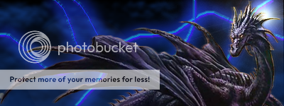
Dragon.png


my SOTW piece. tried new stuff
 
The lighting is...placed on the wrong spot
Well the colours match.....sorta :|
lack of effects

..not sure what else to say :S, Good job though.
 
Shadow not being mean but we told you to use tuts and by the looks of your sigs you dont :/

Not being mean but seriously use tuts!
 
i do this at school. the site is saved on my computer there. i'll have to post it tomorrow. it was for the background stuff though
 
...do it on the computer then?

I think you need to work on making complete pieces, instead of using a tut for the background and tossing a render on there. I used to do the same thing and it didn't help me at all.
 
Shadow not being mean but we told you to use tuts and by the looks of your sigs you dont :/

Not being mean but seriously use tuts!

ew tutorials.
if you use tutorials, use them just to get a feel for what your doing. develop your own style.

but ya your sigs could use some major work brah...

keep at it tho.
 
Back
Top