Navigation
Install the app
How to install the app on iOS
Follow along with the video below to see how to install our site as a web app on your home screen.
Note: This feature may not be available in some browsers.
More options
You are using an out of date browser. It may not display this or other websites correctly.
You should upgrade or use an alternative browser.
You should upgrade or use an alternative browser.
Rate the sig above you! w00t!
- Thread starter Marthmaster
- Start date
Luigi man
Burger ringz.
0.000000001/10 WOAH the magic blue text :lol: only joking
SSBBdude
WiiChat Member
9/10
nice_wii
God of rock
8.97663482152234782347238239423454596845693587649867430387290292357283965820245692565645609586730983460987346946857346987252045345629486598326498563498658229834652837562987562347562348972358763856385638465289462896251078287924897248794278378243798567653637202020794343049349873983963400330232097221602106329632598763663954663576/10
Its very shiny
Its very shiny
TortillaChip520
One of the Oceanic 6

rate, por favor?
Samus101
Super Hunter
100000/10 For Samus sig.
Incredible sig, by far the best on WiiChat.
8/10 for Naruto sig.
Incredible sig, by far the best on WiiChat.
8/10 for Naruto sig.
TortillaChip520
One of the Oceanic 6
but i didn't make the samus sig 
lol 7/10, the yellow fractal render looks a little out of place, like it shouldnt be there.
lol 7/10, the yellow fractal render looks a little out of place, like it shouldnt be there.
manred
Animal Collective
10/10
TortillaChip520
One of the Oceanic 6
TortillaChip520
One of the Oceanic 6
i was talking to Samus101.
i'll critique urs though, gladly.
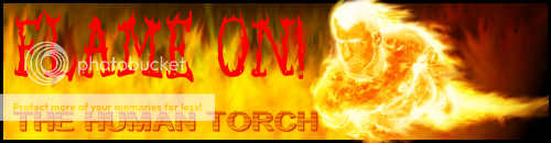
the Flame On looks a little plain, you should use a little trick i do if the font doesn't have an outline. just type the exact same thing in the exact same font, just in a different color, and put it behind (or over, if you prefer) that text to give it a kind of shadow.
i'll critique urs though, gladly.
the Flame On looks a little plain, you should use a little trick i do if the font doesn't have an outline. just type the exact same thing in the exact same font, just in a different color, and put it behind (or over, if you prefer) that text to give it a kind of shadow.