Crap, I wish I had a Wacom Tablet. >.> I was thinking of "drawing" a background on the notebook paper, like some Yoshi-esque hills and maybe some clouds. But drawing it with the pencil tool may not turn out too great. Or maybe just some shapes and patterns, like you said. I also want to take it out of grayscale and make it full color.ssbb_lover said:Defo not C4D's. Not for that sig. You could include some shapes and patterns in there though. It needs a lot of work tbh (@ KC).
Navigation
Install the app
How to install the app on iOS
Follow along with the video below to see how to install our site as a web app on your home screen.

Note: This feature currently requires accessing the site using the built-in Safari browser.
More options
You are using an out of date browser. It may not display this or other websites correctly.
You should upgrade or use an alternative browser.
You should upgrade or use an alternative browser.
SOTW #10 Applications
- Thread starter Gymdawg
- Start date
ssbb_lover
Novocain Stain'd
WOAH MAN LOOK THAT FINE WHITE BORDAA. It's so noticeable on this forum...demonflair said:Why not? Depends on what C4D you're talking about.
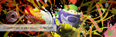
My sig update:

This will be my entry. The render is from Animal Crossing
BTW Tyler added the white border
Wacom. Pff, we all wish KC. That is a GREAT idea though! That would be very original and would look great. There's gotta be some way.KCBlack said:Crap, I wish I had a Wacom Tablet. >.> I was thinking of "drawing" a background on the notebook paper, like some Yoshi-esque hills and maybe some clouds. But drawing it with the pencil tool may not turn out too great. Or maybe just some shapes and patterns, like you said. I also want to take it out of grayscale and make it full color.
demonflair
Slowly returning..
KCBlack said:Crap, I wish I had a Wacom Tablet. >.> I was thinking of "drawing" a background on the notebook paper, like some Yoshi-esque hills and maybe some clouds. But drawing it with the pencil tool may not turn out too great. Or maybe just some shapes and patterns, like you said. I also want to take it out of grayscale and make it full color.
Is that sig any thing near to the one that was screwed??
No, except the black and white and part color aspect of it. Anyway, I redid it.demonflair said:Is that sig any thing near to the one that was screwed??

Better? Should I officially enter this one?
(P.S.: Demonflair, kickass sig.)
EDIT:
THIS IS MY OFFICIAL ENTRY.
Last edited:
ssbb_lover
Novocain Stain'd
I've grown to like this one.
That's my entry for now.
And KC, I love the tape...lmao. Looks great. You can always change your entry, so ya, officially enter it for now.
That's my entry for now.
And KC, I love the tape...lmao. Looks great. You can always change your entry, so ya, officially enter it for now.
Lol thanks. I love your sig all except for one thing. The halftone(?) pattern in the upper right of the background. It's not needed. I think the sig will look beter w/o it. Other than that, nice. If you added some lighting effects, you could completely enhance it. But very original, which is always good.ssbb_lover said:I've grown to like this one.
That's my entry for now.
And KC, I love the tape...lmao. Looks great. You can always change your entry, so ya, officially enter it for now.
ssbb_lover
Novocain Stain'd
Done and done...but how do you mean "improve lighting effects"? I'm a noob still.KCBlack said:Lol thanks. I love your sig all except for one thing. The halftone(?) pattern in the upper right of the background. It's not needed. I think the sig will look beter w/o it. Other than that, nice. If you added some lighting effects, you could completely enhance it. But very original, which is always good.
I haven't really worked with lighting yet. Is all you mean to make it bright in one corner, then in the opposite corner make it darker?Well, I think a good example of lighting is the one in my Naruto sig that won Sotw 8 (I think). That sig is almost nothing but different colored of brushes in multiple layers on different blending modes. Theres some color, some overlay, some linear dodge, etc. I say just play around with crap until it looks good. I've never looked at any tutorials other than to see how to make a couple of effects, so I don't know the "official" way to create lighting effects. Just play around with colors, opacitys, and blending modes. Or you can just forget everything I just said and keep what you have. XPssbb_lover said:Done and done...but how do you mean "improve lighting effects"? I'm a noob still.
tarheelsuperman
...it gonna be zoppity
Anyone care to comment or critique my entry. Its a different style so I need some feedback to get better.
Here it is again so you don't have to go back to page 4.
Thanks Demonflair for the remarks any feedback helps even the negative feedback.
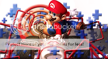
KC I actually like the more colorful sig better. Maybe replace the blocks in the top left with something else though or remove them. The color is almost too bland for the sig in my opinion. The blocks just don't pop like the rest of the sig, but it is still a great entry.
Here it is again so you don't have to go back to page 4.
Thanks Demonflair for the remarks any feedback helps even the negative feedback.
KC I actually like the more colorful sig better. Maybe replace the blocks in the top left with something else though or remove them. The color is almost too bland for the sig in my opinion. The blocks just don't pop like the rest of the sig, but it is still a great entry.
I like it but I think it would look ALOT better if it were smaller.
I've gotta get ps on my computer.. and I never could really figure the render's thing out, I kept putting the whole picture in... is that how it is suposed to be?
I've gotta get ps on my computer.. and I never could really figure the render's thing out, I kept putting the whole picture in... is that how it is suposed to be?
Last edited:
Byuakuya
Bleach & Heroes fan.
Wow, there are some great entries this week.
demonflair
Slowly returning..
tarheelsuperman said:Anyone care to comment or critique my entry. Its a different style so I need some feedback to get better.
Here it is again so you don't have to go back to page 4.
Thanks Demonflair for the remarks any feedback helps even the negative feedback.
KC I actually like the more colorful sig better. Maybe replace the blocks in the top left with something else though or remove them. The color is almost too bland for the sig in my opinion. The blocks just don't pop like the rest of the sig, but it is still a great entry.
No problem. Well to make it better you could just leave the Mario in the Pop-up, and erase those shapes coming out from the sig too, because that doesn't give you the feelling of poping-up imo...
The colors are great in it, but the shapes... not so sure about them... but that only my opinion
Tr1p1ng said:I like it but I think it would look ALOT better if it were smaller.
I've gotta get ps on my computer.. and I never could really figure the render's thing out, I kept putting the whole picture in... is that how it is suposed to be?
Well to make a pop-up sig, you need to make a white bg, then put the render. Do not Apply Image in any case!!! Make a bg that you like then make a white rectangle shape behind the render, put it close to the head of the render, and there you go.
Last edited:
demonflair
Slowly returning..
Spaggy said:Umm, can I enter this?
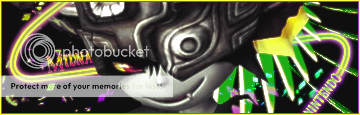
I'm unsure about the border though, so if anyone has any suggestions, I'll be glad to hear them.
Try adding color balance to it, just to see how it would be.