SOTW #10 Applications

Spaggy said:
Umm, can I enter this?

Midnanintendo.png


I'm unsure about the border though, so if anyone has any suggestions, I'll be glad to hear them. :D
I'll probably make a V2 in a few days.

Good work with the pen tool...but no to the green. Also, that feathery bit sticking out of Midna's head is annoying (I know it's from a c4d), so replace it with something else..
 
Spaggy said:
Umm, can I enter this?

Midnanintendo.png


I'm unsure about the border though, so if anyone has any suggestions, I'll be glad to hear them. :D
I'll probably make a V2 in a few days.
Nice to see a new sigmaker, though, I feel that the renders been stretched width wise? Aka it's not in proportion? I may be wrong..
 
I have made alot of sigs for this but I'll enter this one:


sotw.png


Another 2 that I've made for this but won't enter (unless people like one of them better)

SIGCOMPNEW.png


SIGCOMPrevised.png


The idea behind my entered sig is that the name Wii was not only chosen because its easy to say in almost all countries but also as they wanted to demonstrate that it is used to bring people from all backgrounds and races together (hence the different coloured mushrooms)


Yup! Heavy meaning for a sig :lol:

If you like one of my other sigs better, please tell me.
 
demonflair said:
No problem. Well to make it better you could just leave the Mario in the Pop-up, and erase those shapes coming out from the sig too, because that doesn't give you the feelling of poping-up imo...

The colors are great in it, but the shapes... not so sure about them... but that only my opinion :)


Well to make a pop-up sig, you need to make a white bg, then put the render. Do not Apply Image in any case!!! Make a bg that you like then make a white rectangle shape behind the render, put it close to the head of the render, and there you go.
Actually, you could just make it transparent instead of white (which is better in case you submit it elsewhere that doesn't have a White BG) and save it as a PNG. That's what I do with all of my "rounded rectangle" sigs, like the color version of the Paper Mario one I made. Anyway, I agree on not making the shapes pop-out. Also, the whole thing seems slightly dull and blurred as far as the sharpness goes. Maybe try a sharpen? Or add a layer filled with white, set it to overlay, and reduce the opacitiy. That should intensify the color. But it's very interesting regardless. We've got some good entries this week. Noice.
 
By popular demand: Volume 2 :D

Midnabg.png


I did what you said, plus some other stuff. I really hate it though, so I might make another one.

EDIT: The render isn't stretched, I actually didn't do anything to it. Now I see that it takes up a bit too much space. At least that's what I think.
 
Last edited:
Which to use..

BowserEhcopy-1.jpg


BowserEhcopy.jpg


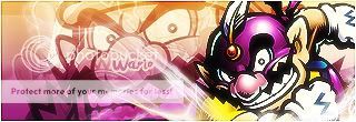
Wario.jpg


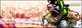
Nintendo2.jpg


...

Hmm..

Might go with the bowser one..
 
Hmm alright..

I might try to fix it up a tiny bit more when I have time...
 
Close, your entry is pretty tight, I'm just not feeling the text. Idk if it's the font or the placement, but something about it seems a little off.
 
Back
Top