Navigation
Install the app
How to install the app on iOS
Follow along with the video below to see how to install our site as a web app on your home screen.
Note: This feature may not be available in some browsers.
More options
You are using an out of date browser. It may not display this or other websites correctly.
You should upgrade or use an alternative browser.
You should upgrade or use an alternative browser.
Official Graphics Comments & Criticism
- Thread starter ssbb_lover
- Start date
Gikoku Harakami
ミュージック
lol How can you bump a stickied thread.
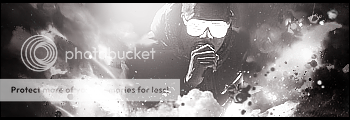
That Kanye? Not bothered by the B&W though I prefer colour. Has a nice atmosphere to it, like a sense of power. The depth is pretty nice, although some parts seem a bit flat (like around the edges of the tag).
Overall, a pretty good job.
Comments plz
That Kanye? Not bothered by the B&W though I prefer colour. Has a nice atmosphere to it, like a sense of power. The depth is pretty nice, although some parts seem a bit flat (like around the edges of the tag).
Overall, a pretty good job.

please kind sirs some constructive criticisms
Although its visually nice (cuz of the girl..lol) it lacks alot. Seems very plain to me. Also the text doesnt fit right.
Comments plz
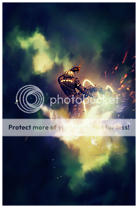
This one seems way to bright. Might want to turn down the light and focus it only on his glasses, since that image is from the glow in the dark tour. Also like Scott said, it feels oddly flat in some areas. I think you got it right with the right side but the left side just seems to flat.
Comments on my first sprite
Can't see it, man.
iRAWR
rawrrr
Comments on my first sprite
I like the colours, smudging, depth, and effects. Only thing bothering me is that the sprite is a tad bit over sharpened..other than that. Amazing job.
Byuakuya
Bleach & Heroes fan.
My thoughts exactly. Nicely done, factoR.I like the colours, smudging, depth, and effects. Only thing bothering me is that the sprite is a tad bit over sharpened..other than that. Amazing job.
Gikoku Harakami
ミュージック
they dont have too do they? lol
Nope. It's just a common preference.
 ), your smudging is quite inspirational. Haven't seen anything like it before, amazing job.
Similar threads
- Replies
- 32
- Views
- 20K