Navigation
Install the app
How to install the app on iOS
Follow along with the video below to see how to install our site as a web app on your home screen.
Note: This feature may not be available in some browsers.
More options
You are using an out of date browser. It may not display this or other websites correctly.
You should upgrade or use an alternative browser.
You should upgrade or use an alternative browser.
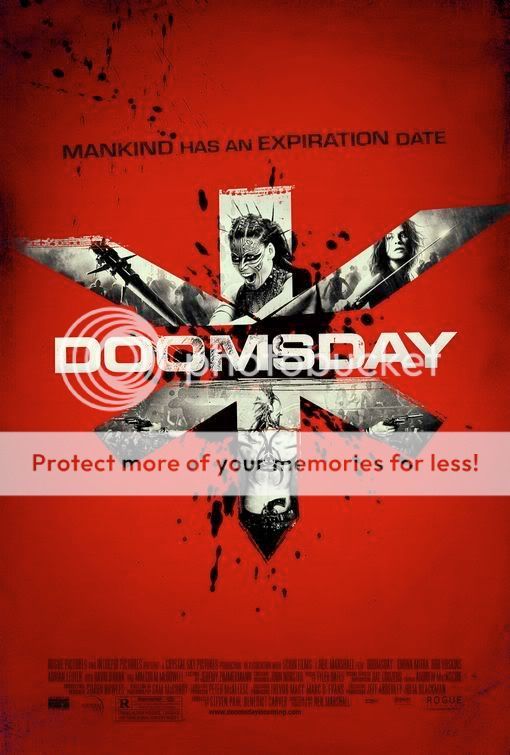
Official Graphics Comments & Criticism
- Thread starter ssbb_lover
- Start date
VidyaVince
vidya gaems
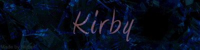
New sig of mine. *check sig*
It's pretty simple, but I like it.
Put a border on the first one. It'll look pretty good, considering it's your first sig.
It's pretty simple, but I like it.
Sparx said:C&C on my sig?
Put a border on the first one. It'll look pretty good, considering it's your first sig.
Last edited:
Monsteroids
Psychedelic Snail
lol.
VidyaVince
vidya gaems
I like the one with the black border better.
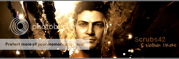
those that you posted are greatSparx said:I'd go with the 2nd one Rob.
Jeez, why doesn't anyone C&C on the sigs I posted?
I like the first and second one(with motion) better
I'd rate them 8/10 due to lack of...stuff...where the text is; a Flame Brush can help with that:yesnod:
great job for your first sig!:thumbsup:
Last edited:
VidyaVince
vidya gaems
ROB64 said:those that you posted are great
I like the first and second one(with motion) better
I'd rate them 8/10 due to lack of...stuff...where the text is:smilewinkgrin:
great job for your first sig!:thumbsup:
Yeah, get rid of some of the blank space by making the sig smaller.

@Dbomb: It's good for a first, pretty much like one of my first ones 
You really need to somehow blend the render into the background, cause most of the time people make a big mistake of simply adding the render into so kickass background, destroying the sig altogether, they make it look like a sticker. But nice try
@Lewi, dont feel it to be honest. Could be a border, why is that "altair" there... i would remove that, makes it look like thats the name. and the text on it "lewi t", could be blended better, i've noticed that with pretty much everyones sigs on here... the text isn't blended at all... make it stand out yea, but make it look like its part of the sig. Nice attempt.
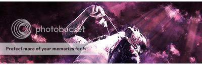
@Sparx, = Not burned, with motion is the best one. Could do with a border, (top and bottom, black, 1 or 2 pixels in height, you'll be surprised how much such a simple thing changes the sig). It's also abit long, the smaller the sig the less you have to fill!
and for your current sig sparx: Thats pretty nice, good way it blends out to colour. your text is good, maybe could do with being clearer though. well, the "x" anyway, you could make the background behind it just slightly darker to get over that.
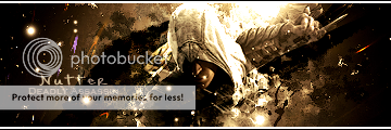
@Rob, i prefer the top one (the one with dark on the right) reason being it adds DEPTH, which is one of the greatest things to do in a sig.
@Syntax, i love the one with your name, did you make it? And i'm gonna try it myself if thats ok with you
This long post has come as a result of im BORED.
You really need to somehow blend the render into the background, cause most of the time people make a big mistake of simply adding the render into so kickass background, destroying the sig altogether, they make it look like a sticker. But nice try
@Lewi, dont feel it to be honest. Could be a border, why is that "altair" there... i would remove that, makes it look like thats the name. and the text on it "lewi t", could be blended better, i've noticed that with pretty much everyones sigs on here... the text isn't blended at all... make it stand out yea, but make it look like its part of the sig. Nice attempt.
@Sparx, = Not burned, with motion is the best one. Could do with a border, (top and bottom, black, 1 or 2 pixels in height, you'll be surprised how much such a simple thing changes the sig). It's also abit long, the smaller the sig the less you have to fill!
and for your current sig sparx: Thats pretty nice, good way it blends out to colour. your text is good, maybe could do with being clearer though. well, the "x" anyway, you could make the background behind it just slightly darker to get over that.
@Rob, i prefer the top one (the one with dark on the right) reason being it adds DEPTH, which is one of the greatest things to do in a sig.
@Syntax, i love the one with your name, did you make it? And i'm gonna try it myself if thats ok with you
This long post has come as a result of im BORED.
Last edited:
manred
Animal Collective
Sparx said:Lewi-Is that even your sig? Looks like it belongs to "Altair"?
I don't like it, I Think you sharpened it too much, and I dont like the text.
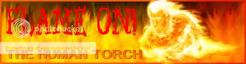
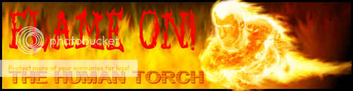
First attempt ever to make a sig: C&C please, keep in mind this is my first sig ever. I tried to make a better fire but it didn't work out
Before:
Give me your opinion:

Not burned, with motion.
or....

Burned with motion.
or....

Not burned without motion.
Choose your favourite, and C&C on that one please. Thank you.
IMO, the second one is the best. Though there is too much space. Maybe you could crop some of the left side and put some more brushes in the background and it would look great.:yesnod:
Edit: Good job btw.
That's what I was trying to accomplish with the dark space.nutter said:@Rob, i prefer the top one (the one with dark on the right) reason being it adds DEPTH, which is one of the greatest things to do in a sig.
Thanks for the comments!
Let's see some of your sigs, nutter.
(other than the ones Foosoo had:lol
lol thats okROB64 said:That's what I was trying to accomplish with the dark space.
Thanks for the comments!
I was thinking about posting here... but ok...ROB64 said:Let's see some of your sigs, nutter.
(other than the ones Foosoo had:lol
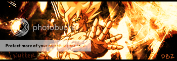
Some of my latest stuff, haven't had time to make any new because of college work...
What do ya all think?
Similar threads
- Replies
- 32
- Views
- 20K