blueovalboy7
They call me Hammy!
More choices is always a plus. No problem on the feedback, just trying to help.
Follow along with the video below to see how to install our site as a web app on your home screen.
Note: This feature may not be available in some browsers.


Wow. This is the first time I've gotten feedback from you and I truly appreciate it! You completely "get" what I was going for. I wanted to create a background atmosphere that was fully cohesive with Kanye's outfit while trying my best not to overshadow it. It's great to know that I pulled it off. I didn't think anyone would like it. I did the 2nd version first but was unhappy with the color scheme so I tried again with the two-colored argyle. I personally prefer the more vibrant top version as well. I'll try to create more of a happy medium by adding some paper scans on top of the argyle later.Celeste - Kanye Diamonds
As usual, your compositions are wonderful, which we see once again here. The consistent theme you established with the diamonds in the background and foreground are great, color usage is vibrant. From the busy combination of "random things" and text that appear torn to the paper-like grain effect give a nice scrapbook style that fits with Kanye's colorful, expressive fashion sense. As such, I can see that there was a conscious reasoning to connect Kanye with the theme, so I appreciate this from one artist to another.
To compare the two, I actually prefer the bottom picture's vibrance/texture (the "paper scan lines" look on the reddish orange diamonds) and prefer the top's color scheme (the two-colored diamonds in the background and the greater use of magentas). So I would assume a more vibrant top version would create a happy medium. Anyway, great stuff.
RAID!!!!!!!!
even sexy back then =P


Yea thats right, I jacked yo **** nucca xD <3
 <3
<3
Pahahaha
was thinking 'wtffffff?'
but yeah got dayum them sigs are good. How'd you make those? (-8
@Bliss:
1: Nice focus used on the render. Good use of c4d's. However, I'd try to blend in the c4d's a bit more. Also a good use of text.
2: Good use of colours and brushes. I prefer this over the first one you posted. There is a good use of lighting and it draws more attention to the render/stock you used. Very nice work.
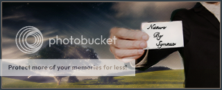
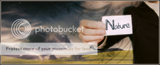
Version # 1:
Version #2:
xD
They were easy, i right clicked on your wiichat logo thingy and got ur PB acct and had some fun....hard work =P
You do know those are Mikey's lol
@Bliss:
1: Nice focus used on the render. Good use of c4d's. However, I'd try to blend in the c4d's a bit more. Also a good use of text.
2: Good use of colours and brushes. I prefer this over the first one you posted. There is a good use of lighting and it draws more attention to the render/stock you used. Very nice work.
Version # 1:
Version #2:
paha, oh nicholas what are you like.
Thanks Matt, baha.
Version 2 is winwinwinwin. You made the text and render look alot better, hand stands out more.
Syntax, v2 looks so good. It looks like there's a storm going on and the brushes are swirling winds. WAY better font, too.