Official Graphics Comments & Criticism

comments on this:
Kirby.png


i took a basic kirby and then my favorite 2 forms of him.
made some brush work on the background then used a gradient map on it
overall i like it but would like to know what all of you think
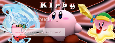
 
While you're still a beginner, there are certain issues regarding this signature. The first is the use of renders. When making a signature, you want to have one main focus point which draws in the viewer. With the two other renders added, excluding the one from the middle, it throws off what seems to be the main focus point of the signature. If you want to use more than one render you need to make sure to have a main focal point. This mainly has to do with blending in renders and making them either stand out or appear in the background. Which, I've attempted to cover in the next paragraph.

Another issue regarding this signature is that there hasn't been much work done in blending in the renders or creating a flow with the signature. There needs to be an attempt made to blend in the render with the rest of the signature. To throw in various renders and apply little to no blending options lowers the strength of a signature. You should also be looking at blending in the renders with the background. While, at the same time, drawing more attention to the image. You can do this by simply adding in gradient maps and messing around with the layer settings (ie overlay, soft light, lighten) and changing the opacity of that layer.

My suggestion in regards of improvement would be to take a look at a few beginner signature tutorials. I also suggest on checking out the provided links for tutorials mentioned in the stickied threads. Lastly, it is also helpful to pick up various techniques from full signature tutorials. What I'm trying to say is that if you see a tutorial with a background you like try to imitate that style. Now, that doesn't mean you need to follow every step of that tutorial. Hopefully that makes some sense.

While this critique may be a bit harsh, as you are still learning, don't try and take it personally. It's only meant to help you improve.
 
Last edited:
Wow. This is the first time I've gotten feedback from you and I truly appreciate it! You completely "get" what I was going for. I wanted to create a background atmosphere that was fully cohesive with Kanye's outfit while trying my best not to overshadow it. It's great to know that I pulled it off. I didn't think anyone would like it. I did the 2nd version first but was unhappy with the color scheme so I tried again with the two-colored argyle. I personally prefer the more vibrant top version as well. I'll try to create more of a happy medium by adding some paper scans on top of the argyle later.

Thanks again!

You're welcome. I'm glad the C&C helped. =)
 
Messing around, trying to get that HDR effect without any add-on software

Original
o785k0.jpg

25z40sw.png
 
Here's a simple piece I'm working on. Any suggestions on changes or where I should go from here, any input is appreciated.

Nature-1-1.png


I did the render and couldn't decide on the background
 
Ew gross, the background is edgy squares with horrible colors and render.
 
^^. I dont its just the BG looks nice. Its not the best but i like it.
 
Panda, I like the current.

Prinny, don't like the sig (ugh colors), but the render is nice.
 
Back
Top