Official Graphics Comments & Criticism

Hmm..still using two renders eh? >.<

anyways, not much i could say...except for lack of effects, flow, a good lightsource, and a better focal. :|
 
Didn't you "leave the internet"?

Who is he anyway?


I did the render and couldn't decide on the background

It's decent, I actually like the squares (reminds of this one classic abstract piece).. it's different, which is why I like it. Colors don't really bother me, makes me think of the 80's for some reason.
 
shadow it would look better if the effects worked with the render more. Its too hard to use 2 pictures and have the effects work with them both. stick with one. Or at least one area.
I don't know what else to say, if your friend likes it then good for him i guess.
For SOTW:
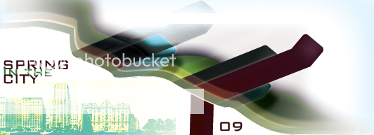
Picture18-2.png

I did not make those buildings, so i cheated. I feel bad.
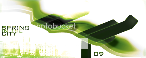
Another version
Picture19-4.png
 
Last edited:
could i get opinions on this?

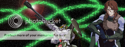
Dynames.png


i'm making it for a friend and i need to know what should be done.

See previous response below:

While you're still a beginner, there are certain issues regarding this signature. The first is the use of renders. When making a signature, you want to have one main focus point which draws in the viewer. With the two other renders added, excluding the one from the middle, it throws off what seems to be the main focus point of the signature. If you want to use more than one render you need to make sure to have a main focal point. This mainly has to do with blending in renders and making them either stand out or appear in the background. Which, I've attempted to cover in the next paragraph.

Another issue regarding this signature is that there hasn't been much work done in blending in the renders or creating a flow with the signature. There needs to be an attempt made to blend in the render with the rest of the signature. To throw in various renders and apply little to no blending options lowers the strength of a signature. You should also be looking at blending in the renders with the background. While, at the same time, drawing more attention to the image. You can do this by simply adding in gradient maps and messing around with the layer settings (ie overlay, soft light, lighten) and changing the opacity of that layer.

My suggestion in regards of improvement would be to take a look at a few beginner signature tutorials. I also suggest on checking out the provided links for tutorials mentioned in the stickied threads. Lastly, it is also helpful to pick up various techniques from full signature tutorials. What I'm trying to say is that if you see a tutorial with a background you like try to imitate that style. Now, that doesn't mean you need to follow every step of that tutorial. Hopefully that makes some sense.

While this critique may be a bit harsh, as you are still learning, don't try and take it personally. It's only meant to help you improve.

With that out of the way, now onto my feedback of this signature. The truth is, unless you start using tutorials and or pick up new skills you wont be improving anytime soon. It is important that you take advantage of tutorials as they can help you improve your skills. Also, as said before, there isn't much of a focus with your signatures. If you're going to use more than one render you need to have a main focus point. Specifically, one of the renders. Lastly, your background doesn't match the signature and or tie in with the renders used. It also looks a bit choppy. I seriously suggest you take the advice of the other artists and begin focusing on tutorials.
 
Last edited:
can anybody direct me to a bruce lee render?
 
With that out of the way, now onto my feedback of this signature. The truth is, unless you start using tutorials and or pick up new skills you wont be improving anytime soon. It is important that you take advantage of tutorials as they can help you improve your skills. Also, as said before, there isn't much of a focus with your signatures. If you're going to use more than one render you need to have a main focus point. Specifically, one of the renders. Lastly, your background doesn't match the signature and or tie in with the renders used. It also looks a bit choppy. I seriously suggest you take the advice of the other artists and begin focusing on tutorials.

first off nobody seems to notice that i said i'm still working on it.

@bold text: i'm trying to make the guy on the right the focus.

@underlined text: you've never seen Gundam 00 have you? if not then here's all you need to know
the guy is Lockon Stratos and the robot is his Gundam Dynames. in Gundam 00 the gundams give off these special green particles. also there are a lot of space fights.
with that little knowledge you can probably get what i'm going for here.
 
All that considered, it's still looking kinda crappy, so I suggest you stop posting in here seeking advice until you can actually take some and use tutorials like everyone has said about a bajillion times.
 
@bold text: i'm trying to make the guy on the right the focus.

If so. Then I sugggest taking out the gundam in the middle.

@underlined text: you've never seen Gundam 00 have you? if not then here's all you need to know
the guy is Lockon Stratos and the robot is his Gundam Dynames. in Gundam 00 the gundams give off these special green particles. also there are a lot of space fights.
with that little knowledge you can probably get what i'm going for here.

I see what your doing. Read some tuts so you can execute it better. ;)
 
first off nobody seems to notice that i said i'm still working on it.

@bold text: i'm trying to make the guy on the right the focus.

@underlined text: you've never seen Gundam 00 have you? if not then here's all you need to know
the guy is Lockon Stratos and the robot is his Gundam Dynames. in Gundam 00 the gundams give off these special green particles. also there are a lot of space fights.
with that little knowledge you can probably get what i'm going for here.

While I understand that you may still be learning, there has to be more effort put into your signatures. From the looks of it, there doesn't seem to be much work done on the background. When you're making a background, you want it to blend in with the render('s) you choose to use. If they don't match it brings down the overall effect of the signature.
 
Back
Top