Navigation
Install the app
How to install the app on iOS
Follow along with the video below to see how to install our site as a web app on your home screen.
Note: This feature may not be available in some browsers.
More options
You are using an out of date browser. It may not display this or other websites correctly.
You should upgrade or use an alternative browser.
You should upgrade or use an alternative browser.
Official Graphics Comments & Criticism
- Thread starter ssbb_lover
- Start date


LeWaffles
CUSTOM
I like it, i wanted to make an argil sig too.
I was just wondering, since you have this scrap book style, do you ever use the same render?
I was just wondering, since you have this scrap book style, do you ever use the same render?
Sorry bb I'm unsure what you mean, explain? And thanks!I like it, i wanted to make an argil sig too.
I was just wondering, since you have this scrap book style, do you ever use the same render?
King Wiired
HITLER ME JEZ
My favourite sig of yours evur Celeste.Celeste said:

LeWaffles
CUSTOM
Sorry bb I'm unsure what you mean, explain? And thanks!
I was just wondering if i could steal some of your renders, some people just kinda throw em away after. I love those Balloons. Please? :smilewinkgrin:
Balloons are attached to the girl, though.I was just wondering if i could steal some of your renders, some people just kinda throw em away after. I love those Balloons. Please? :smilewinkgrin:
Here's the render I used anyway: http://officialpsds.com/Demi-Lovato-PSD23228.html
@King Wiired: Thank you! ;D
EDIT: Waffles, I found you some balloons: http://officialpsds.com/search?criteria=balloons
Last edited:

Shadow*91
Not Here
nice stuff. blue seems like it doesn't fit for some reason. and don't add text.
made this on wednesday but never posted it. opinions?
made this on wednesday but never posted it. opinions?
LeWaffles
CUSTOM
Thanks for the balloons Celeste! Hopefully Nature will be the topic for the SOTW, so i can use them!
@Syntax: looks good, Great for a sports sig, liking the buildings as an effect. Kinda simple but good for what it is, nice job!
@Shadow: i don't know who Tobi is so maybe it affects my judgement. Its not too appealing IMO but its good to see you are experimenting with the render more.
@Syntax: looks good, Great for a sports sig, liking the buildings as an effect. Kinda simple but good for what it is, nice job!
@Shadow: i don't know who Tobi is so maybe it affects my judgement. Its not too appealing IMO but its good to see you are experimenting with the render more.
Shadow*91
Not Here
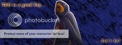
Tobi is part of the Akatsuki in Naruto. one character said the phrase 'Tobi is a good boy' and suddenly every fan made something with tobi doing something stupid while saying that. he was recently revealed to be an evil-mastermind, not some goofy idiot. i tried to get the 'dark' side of Tobi in that piece.
nice stuff. blue seems like it doesn't fit for some reason. and don't add text.
made this on wednesday but never posted it. opinions?
Decent piece, i see you were goin for the 'rain' effect for this one. First thing i notice that bothers me is the text. [STRIKE]Try[/STRIKE] Dont ever use effects on your type. Also check out some tutorials, like many of us have told u already, if u dont understand them, we will help you.

blueovalboy7
They call me Hammy!
I like it, it's a good looking piece, I would just go with smoothing on the guy holding the card, and IMO the text needs a slight rotation to be parallel with the edges of the card and you'll be sitting pretty. Oh and the text looks superficial, maybe add some effects/filters to make it look like it is actually on the card. Just a thought.
I like it, it's a good looking piece, I would just go with smoothing on the guy holding the card, and IMO the text needs a slight rotation to be parallel with the edges of the card and you'll be sitting pretty. Oh and the text looks superficial, maybe add some effects/filters to make it look like it is actually on the card. Just a thought.
I'll give that a shot. I'll also try downloading some new text off of dafont.com. Could use more choices.. Thanks for the feedback on the signature.
Similar threads
- Replies
- 32
- Views
- 20K