VidyaVince
vidya gaems
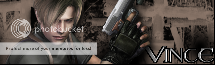
Here's a new one I made. I really like it. I'm not a real big artisan with GIMP, so any help from experts (oh hai Monsteroids), I'd really appreciate it.
Follow along with the video below to see how to install our site as a web app on your home screen.
Note: This feature may not be available in some browsers.
manred said:My latest work.

C&C please.


tarheelsuperman said:Stick with one render b/c with more than one no one knows what the focus of the signature is and you need to create somewhat of a flow with your sig. If you make your sig size smaller you shouldn't need but one render and you will not feel like you have that much blank canvas to fill up. I would also make your text smaller and less front and center.
I think you'll like your outcome a lot better if you just give the smaller one render sig a shot. Trust me I had the same problem when I first started making sigs. I thought the bigger the better. See...
")

I like the choice of render and the canvas size, but the BG is a little bit simple.manred said:Thanks for the advice. I think I'm going to recreate it but with the one on the right side. I was thinking about doing something different with the font, but because there were two renders, I wasn't sure where to put it.
I think from now on I'll stick with just one render. Thanks.
Update: Here it is with one render.
C&C please.
tarheelsuperman said:
Bliss said:Great work as always...like the bottom one the best out of the three
tarheelsuperman said:Manred...It looks better nice render choice and the text is better too. now you need to work on sharpening (mainly the render) and blurring (mainly in the bg) to create some depth. Maybe something in the bg to create flow with the render. It's looking a lot better though. Good work.
Byuakuya said:I like the choice of render and the canvas size, but the BG is a little bit simple.
Other than that, it looks good. Nicely done.
Bliss said:Here is one i did over the weekend........C&C please

Sparx said:May I ask that everyone give me the sources of their pics please
I'm searching but I can't find ANY good pics AT ALL!
Gikoku said:Way too sharp, turn the sharpness down some, and it'll be much better.
Other than that, I really like it.
King Wiired said:I get my stocks/renders from PlanetRenders or sxc.hu.