Official Graphics Comments & Criticism

Sparx said:
Dude thats awesome, your getting so much more better. You should keep this one, and in your spare time make me more :D

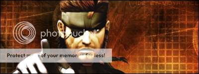
I dunno, this is my taste, not everyone's but I don't like it when people put texts on their arms and stuff. I prefer it being alone in the corner or something. Thats how I like it, just say, you could of gone with a better font.

Thanks for the compliments.

I was thinking of putting the name somewhere else but I like to put it on the focus point. I was going to put it on the sword, but the render would have been too small to show the full sword so I kept it like that.
 
Wii_Smurf said:
Heres my latest. C&C?

HaloIIJPEG.jpg

??
Looking at it now, I hate the text but C&C Anyways
 
Speaking of good sigs, I know you didn't ask for C&C for your sig, BUT I LOVE IT. Dude that has to g in one of my fave sigs..love it. Awesome.
 
What program do you use? I wanna show you something privately but its kinda embarressing do you have MSN or yahoo?
 
well here is the sig i entered for SOTW...wat u guys think?

psylocke_sig.png
 
I like it. Most people will complain about the light but I like the darkness you've put into it
The text I don't like, try to move it's position
Other than that I do like it

How about my latest?

Wii_Smurf said:
 
Thanks Wii Smurf, i was thinkin of just takin out the text in general.
 
Sorry for the DP

made a few changes
psylocke_sig-1.png


Wii Smurf, as for ur new one. I like it has a lot goin on but it fits. You managed to make a lot look good and not draw away from the focal.
 
Bliss said:
Sorry for the DP

made a few changes
psylocke_sig-1.png


Wii Smurf, as for ur new one. I like it has a lot goin on but it fits. You managed to make a lot look good and not draw away from the focal.

I like it, but the text is small, and I can't really see it.
 
Back
Top