Navigation
Install the app
How to install the app on iOS
Follow along with the video below to see how to install our site as a web app on your home screen.
Note: This feature may not be available in some browsers.
More options
You are using an out of date browser. It may not display this or other websites correctly.
You should upgrade or use an alternative browser.
You should upgrade or use an alternative browser.
SOTW Contest #4 Application
- Thread starter Brawny
- Start date
King Wiired
HITLER ME JEZ
Can't decide whether I'll enter this or not. Got alotta P.E revision today - GCSE exam's on Friday.. Though I may find a bit of time for it later :] keep entering lads!
Great topic, wish I could get in on it. >.< I will if I manage to get my comp running again today. On my friend's right now.  Great job Close, but it looks oversharpened and, IMO, some lighting dynamics can COMPLETELY improve the look of the sig. It's still great as it is though.
Great job Close, but it looks oversharpened and, IMO, some lighting dynamics can COMPLETELY improve the look of the sig. It's still great as it is though.ssbb_lover
Novocain Stain'd
Woah, KC. :tard: Where you been, your comp crash?KCBlack said:Great topic, wish I could get in on it. >.< I will if I manage to get my comp running again today. On my friend's right now.


ssbb_lover
Novocain Stain'd
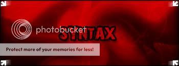
What's that supposed to mean, Coleman?...coleman said:I Think I'm seeing a trend with Syntax's sigs...
ssbb_lover
Novocain Stain'd
What's up with you and arrows? Lol, you can barely leave them out of any of your sigs.Syntax said:Probably the arrows on the corner of the sig..
ssbb_lover
Novocain Stain'd
Thank you! Lol, I wanna see some new techniques from you.Syntax said:The only reason I added them to the sig is that it was a bit empty...
Oh and I'm still trying to look for some nice tutorials.. so eventually there will be no more arrows...
Actually, I think sometimes he overuses them, but it's all good.coleman said:Yeah, I was talkin about the arrows. You use them in good taste, though. I like em, especially in your hockey-themed sig.